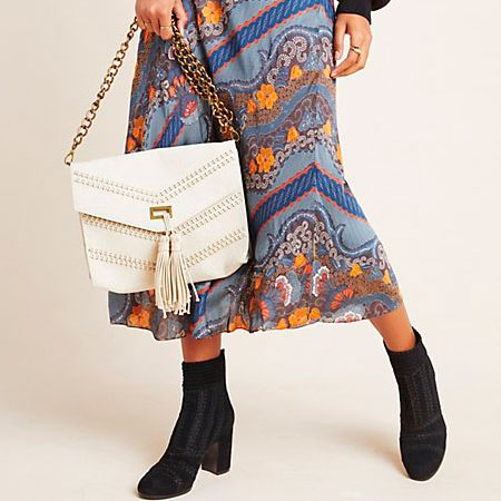
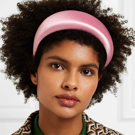
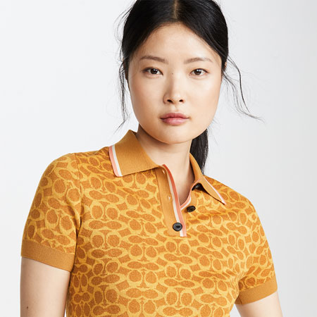
2012 was the year for colour and pattern. For the first time in ages, retail gave us an excellent assortment of colours. Delicate pastels, blinding brights, mild mid-tones, rich jewel tones, warm earth tones and all sorts of versatile neutrals. 2013 continues to showcase a vast assortment of colour and I couldn’t be happier about it. There is something for everyone, and long may it last.
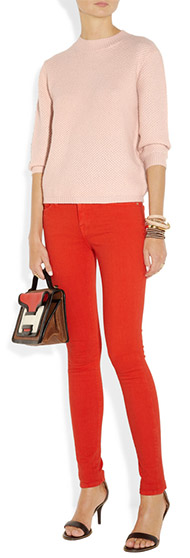
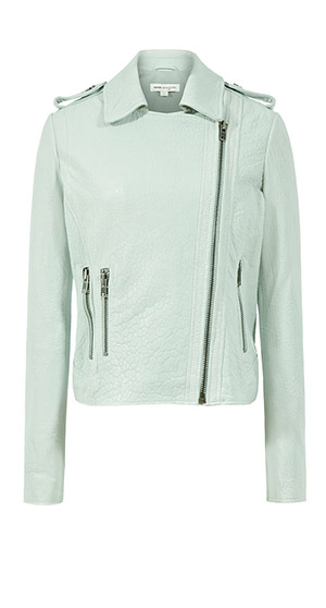
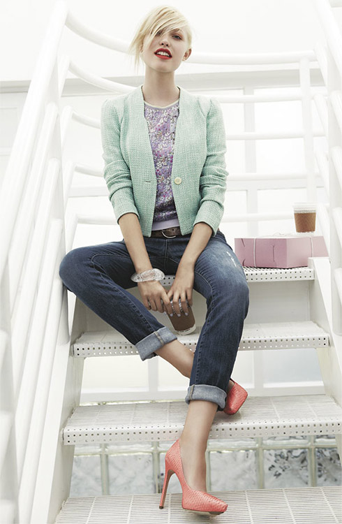
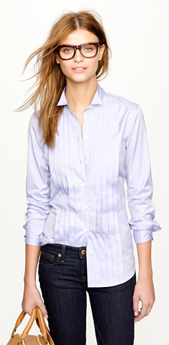
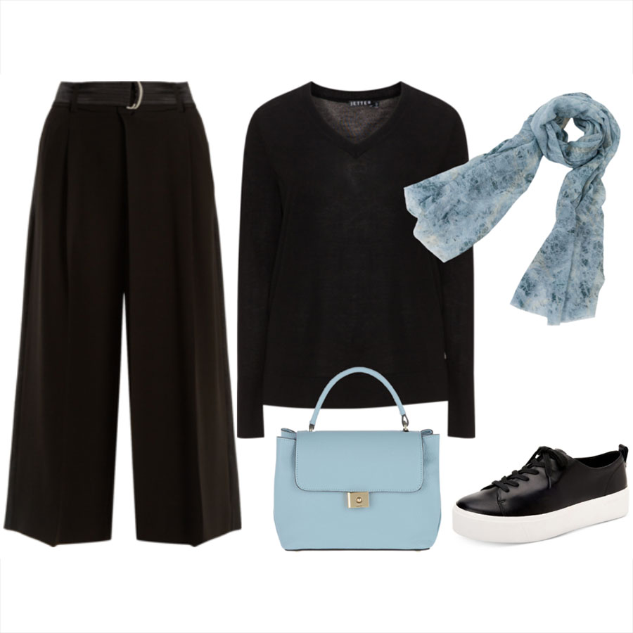
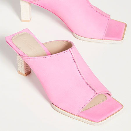
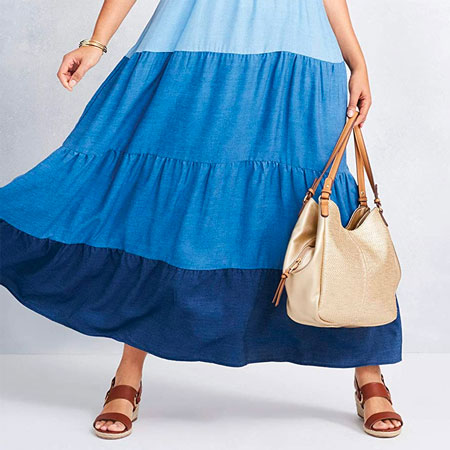
Our Spring season has opened up with a strong nod to pastels and mid-tones. By mid-tones I mean shades that are deeper than pastels but not as saturated as brights. I also like to call them “ice cream tones”. These lighter colours are coming through in all wardrobe items — clothing, footwear and accessories.
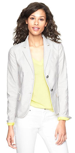
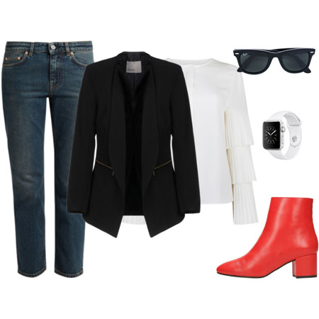
To my eye, pastels and mid-tones look ultra fresh, especially when worn with shades of white, metallics, dove grey, stone and/or faded blue denim. I also love them with tonal brights (see the gelato-inspired tonal outfit formula). I like pastels a little less, but still like them when they are matched with dark neutrals or when they are patterned. And I like them matched with black, grey and white.
My favourite pastels and mid-tones are blue and pink. I used to wear a LOT of light blue in the ’90s. I also wore peach and baby pink back then. But it all came to grinding halt and I can’t remember why. But I rekindled my love for light blue, mid-tone blue and soft pink last year and I’m enjoying how these softer shades have complemented my wardrobe of black, white and sour brights.
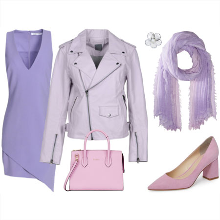
I do have a few clients who wear lilac and soft pink with the best of them. In fact, we often build wardrobe capsules around these pastels because they are their best colours. But I’m having a heck of a time convincing most of my clients that pastels and mid-tones can be fab. There seem to be many bad associations with this part of the colour spectrum. Frumpy, old, prissy, twee, juvenile, Easter egg-ish, weak, boring, overly preppy, insipid, frivolous, unintelligent and unattractive. Quite the opposite to fierce, energizing, interesting, strong, intelligent and powerful. Furthermore, most of my clients feel that pastels and mid-tones are unflattering, sickly and draining against their complexion.
I hope that pastels become more popular because I think they can be worn just beautifully, even if they are worn only as accents. Soft, yet strong. Modern, trendy and sassy. Clean, crisp and yummy. And definitely intelligent. And after seeing most of the Fall 2013 shows, pastels are also trending for Autumn and Winter. Check out this lilac and burgundy outfit. Winter white with light blue. And a pale pink coat with rich neutrals.
What’s your verdict on the pastel and mid-tone trend? Will you be wearing these colours, or do you find them unflattering, twee and juvenile?


