This is old news to some of you because YLF forum member Tanya beat me to the punch last week, but here are Pantone’s Top 10 colours for Spring 2011. For kicks you can compare them to last year’s fashion and colour report.
At first glance the colours look quite pastel and not at all representative of what I saw on the runways of Spring Fashion Week last September. But clicking on each individual block of colour you can see the spectrum of shades embodied in the sketches of the designers.
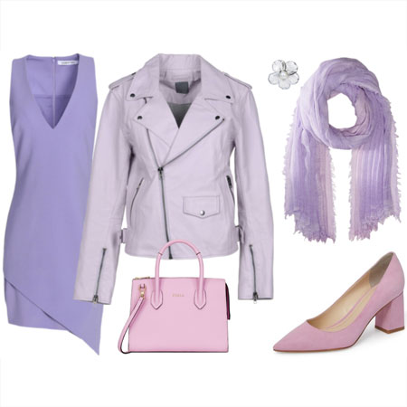
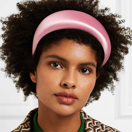
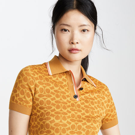
Take, for example, “Honeysuckle”. Although the colour looks like a lipstick pink, the outfit colours range from pink and coral to a much richer, pinkish tomato red. The same goes for pantone colour “Beeswax” which looks like a mango yellow, but the outfit sketches also represent citron.
So it’s important to not take the exact shade of these colours too literally. Instead think of each block as an inspirational umbrella colour under which there are many interpretations and levels of saturation. Still, the hues that I saw at Fashion Week were more vibrant – and we have the photographs to prove it (check out Carlos Miele, Thuy and Georges Chakra).
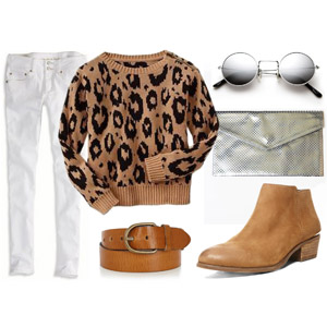
I also find it strange that beige does not have its own block on Pantone’s list. Beige is represented in “russet” (click on the block to see additional sketches), but it doesn’t seem to denote the same level of importance that way. And based on what I’ve seen and read, Spring is going to be full of beige.
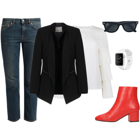
You will find lots of colour variation in a fashion season, even though some colours will be more “happening” and “new” than others. Of course you’ll find black and white each season so never fear when they aren’t represented in a trend forecast like this Pantone report.
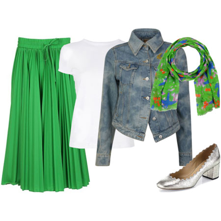
I’ve got my money on colours like citron yellow, tomato red, lavender purple and beige as the biggest colours for Spring and Summer 2011. We’ll see how right I am as the season unfolds.
