One of my style goals for 2014 was to update my eyewear. I wear specs all day, except when I’m cooking or at the computer, and I have three pairs in rotation. The newest of these is 5 years old, so it is definitely time for a style and prescription update.
In the past I have always bought eyewear in a specialized, brick-and-mortar eyeglasses store. For me, specs are like jewellery, so I’m very particular. Frames can be handmade works of art, with quality, craftsmanship and detailing that are sublime. I also enjoy the retail environment, the process, the service, and the assortment of styles available in these stores.
On the other hand, new companies like Warby Parker and Rivet & Sway offer a compelling alternative. The model is convenient — you choose several pairs and they send them to you to try at no cost — and the prices are much, much lower than traditional eyeglasses stores.
As much as I wanted to try the new online model, I couldn’t find anything even close to the aesthetic I was looking for in their ranges. Even if I had found frames that I liked, I must admit that I would miss the uniqueness of a pair chosen from a specialized store.
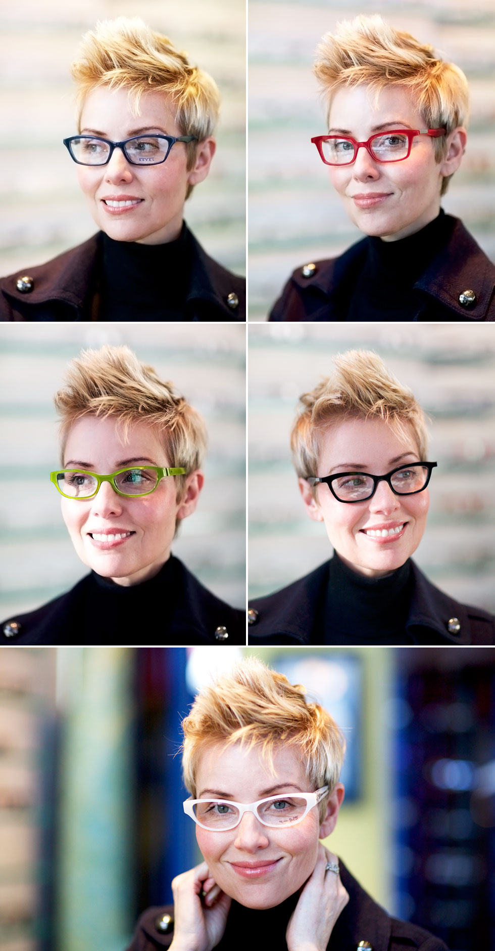
After trying on frames in all sorts of shapes and colours, I found myself at Market Optical in University Village, Seattle for the final cut. These frames, shown below, were special ordered so that I could see them in different colours. Sometimes changing the colour of a set of frames makes all the difference. Most stores will do special orders for you to try, but will require a deposit before doing so.
I am particularly fussy about the fit of my frames, and uncompromising about the following:
- No nose-pads because I find them very uncomfortable.
- The top part of the frames must follow the line of my brow very deliberately,
- The frames must “lift” at the bottom corners near my cheekbones. No drooping.
- My eyes must be centered in the frames.
I find it hard to find frames that fit well. My head is quite small relative to my facial features, so I often feel overwhelmed by frames. Kiddies frames do not work at all because my eyes are too big, and adult frames are often too wide and deep. And wearing ultra trendy “geek-chic” oversized specs doesn’t work with my features.
Aesthetically I wanted frames that were softer and deeper than the Retro, Graphic and Sporty ones I have today. They have to work with my style descriptors, Modern, Simple, Clean, Dressy and Bold, and not be overly dramatic, arty, or oversized.

This is the pair I chose. Greg and I loved these bright apple green frames best because their fit, colour and style integrity were spot on. Chunky, yet refined and interesting. They add a softer element to my outfits (another style goal) and make my dark green eyes look greener. Not to mention that this shade of sour apple or lime green is my favourite colour. If you’re a golden oldie YLF’er, you might remember that this was the predominant colour on the site when we launched in 2006.
Just for fun, here are some thoughts on the other pairs that made my final shortlist:
- The dark blue frames are a pretty colour and flattering fit from the front, but two things made them not the frames for me. First, Greg thought they looked a little conservative and not modern enough for my style. And second, I didn’t like the narrow width of the temples. Although my old black half-rimmed retro cat’s eye specs have narrow temples, they work with the overall daintier scale of those frames. I much prefer wider temples on deeper frames.
- The red frames are a good shape, although the angular bottom corners are a little harsh. I first tried these on in grey and felt very “Hugo Boss”, which wasn’t a bad thing because I like the style integrity of that designer. Knowing that I’m not a fan of grey, Greg suggested I try them in red instead. But neither of us liked this shade of red. Ultimately, I felt like these frames were wearing me so they were cut from the list.
- The black frames are by the same designer as the red. A very similar shape, but smaller and more round. The shape is flattering, and the rounder bottom corners soften the entire look of the frames. But we did not like the harshness of the black, and the temples were a little long for my small head.
- The white frames were a strong contender and took second place after the apple green. A fabulous shade of white, a flattering shape, super modern and simple, chunky yet refined, nice and bold, yet adequately soft. Greg loved them until he saw the fancy silver hardware on the temples. That was a dealbreaker for me too. Had the temples been plain, I might have come home with these frames.
Wearing high-end eyewear is part of my high-low style, and it’s worth every penny to have a pair that I absolutely love. I received them yesterday and couldn’t bear to take them off. The colour makes me so very happy, and it doesn’t hurt that I can see a whole lot better with the new prescription.