Today’s post is written by the lovely and very eloquent Sally from daily style and body image blog, Already Pretty. Sally is a blogger, freelance journalist and communications professional who sports her body art with style. I asked Sally to write about how she incorporates her tattoos into her daily looks, and how her body art is perceived in the workplace.
As a Minnesota resident, I spend a large portion of every year encased in clothing from top to tail. Scarves, turtlenecks, sweaters, heavy wool skirts, tights, and tall boots shield me from the elements, and from September till early May I trundle through my life bundled. But once the weather warms up, out comes my skin. And with it, my tattoos. And with my tattoos, come the comments.
Many, many times, I’ve had people tell me, “Wow, I never pegged you as the tattoo type!” Now, I’ve lived in San Francisco and Minneapolis – both cities where people under 40 who DON’T have tattoos are relatively uncommon – so I inevitably giggle a little. In this day and age, what exactly is “the tattoo type”? On the other hand, I’m a bubbly, mild-mannered, goody-two-shoes in a lot of ways, so I can see what they’re driving at. And I feel a little surge of pride that I’m expanding the views of someone who believes tattoos are the exclusive purview of bikers, criminals, and slackers. (And that my Badass Quotient just went up.)
But I also have been very mindful of the placement of my body art. I have five pieces, and all can be easily covered by clothing, accessories, or shoes. Many consider their tattoos to be integral to personal style and visual identity, and want them seen as often as possible by as many as possible. I don’t. My tattoos are deeply, deeply personal and I don’t actually care if anyone sees them. Which gives me the freedom to hide them whenever I wish without feeling like I’m purposely masking part of my public identity.
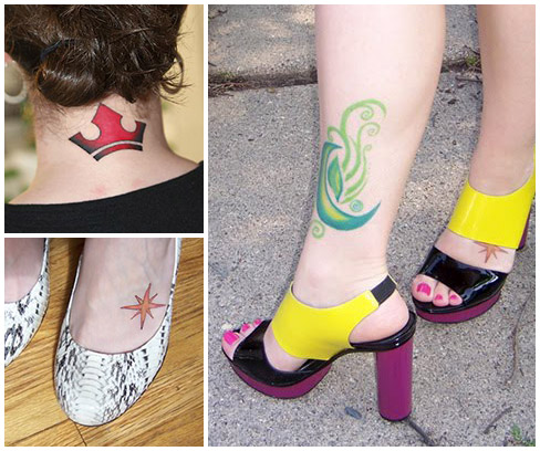
I have never shown any of my tattoos during a job interview, and typically keep them under wraps for a couple of weeks whenever I start working in a new office. I allow my coworkers to observe and accept me before introducing my colorful ankle, bright red neck, and star-stamped foot because, although the offices I’ve worked in have always been relaxed and liberal, I accept that some people still think tattoos are trashy, ugly, weird, stupid. And I’d rather surprise them by being that sweet, capable new girl who just happens to have a giant green swirly thing on her calf, than give them the opportunity to form tattoo-centric prejudices. It’s unfair to judge someone with tattoos as a ne’er-do-well or a freak, just as it’s unfair to judge someone who dyes her hair or pierces her ears or otherwise alters her body for cosmetic reasons. But the bald fact is that some people just hate tattoos and the people who sport them. So I’ve always found it easier and more effective to lay some groundwork first before exposing the ink.
I’m lucky to have avoided public heckling, and have only received compliments on my tattoos from strangers. The green guy seems to enchant elderly women, and it’s always fun to see how surprised and delighted they are to actually ADMIRE a tattoo. I don’t generally go out of my way to expose or conceal my ink when I’m going about my business. I never feel slighted that no one can see the two on my back, or worried that the exposed abstract designs will alarm or offend passersby. I can imagine taking pains to disguise my tattoos if I ever attend a fancy dress ball, receive a public honor, or find myself in a situation where they might be more distracting than decorative. But those situations are yet to arise.
I am quite sure that I will get more tattoos in the future, but I can’t say when. I CAN say that I’ll confine them to areas of my bod that are easily covered. Ink is intensely personal, and I respect everyone’s right to expose and be proud. But my tattoos are mine and mine alone, so I’ll always keep them to myself when I feel the situation warrants.
Do you have tattoos? If not, ever considered getting one? Those who have ink, do you feel comfortable showing it at all times, and to all audiences? When you chose placement, did you consider concealment?
Anyone who thinks all tattoos are awful? Or that anyone who masks them is being dishonest? Let’s hear it!
Photos from Sally’s blog, Already Pretty. Be sure to check it out.


