

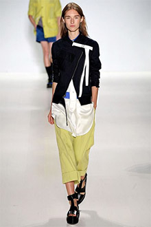
 This colour combination was inspired by a runway look that uses black instead of ink. I prefer the idea of ink blue because it’s softer with the chartreuse and white. Feel free to use navy instead of ink blue, and cream instead of white. The hint of cobalt is quite nice too. Note that chartreuse is a greener and earthier version of citron, and not nearly as bright or yellow.
Think of any way to combine these colours. I’ve put together two easy options to get the ball rolling as we head into Fall.
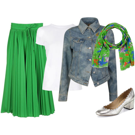
Ink Bottoms, Chartreuse Top & White Accents
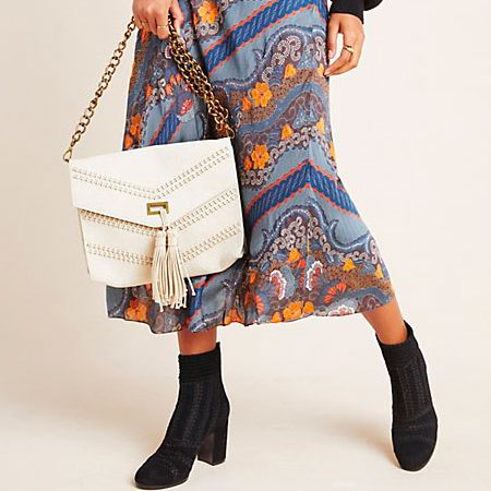
Combine a pair of ink trousers or skirt with a chartreuse top like a blouse or pullover. Choose a solid or patterned top that works with the palette. Top the lot off with a white jacket or vest. I’ve paired the ink ankle pants with ink high-shaft booties, and the skirt with white pumps. You can leave off the white topper if adding white footwear. The touch of cobalt in the bag is optional.
Jeans, White Top, Ink Topper & Chartreuse Bag
Combine a pair of jeans with a white top and ink topper. Finish off the look with footwear that works with the bottoms and a chartreuse bag. I’ve chosen flared jeans, a white tunic, an ink cocoon cardigan, animal print booties and chartreuse satchel. Tailored bootcuts look fresh and so does the pairing with a tunic.
For a look that’s a little harder to pull together, take your cue straight from the runway outfit and combine chartreuse bottoms with a white top and ink jacket. Throw in a cobalt accent just for fun.


