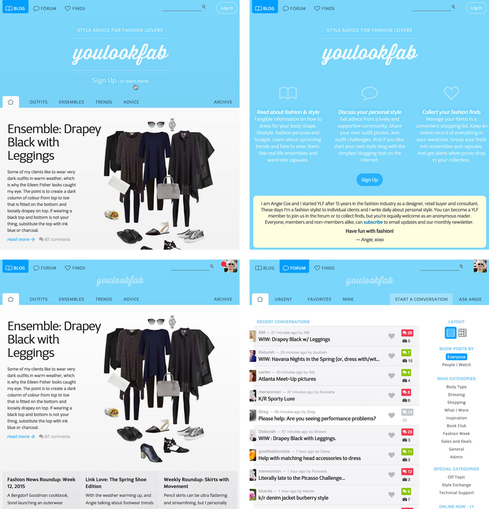
As I’m sure you have noticed, this morning we started the next leg of YLF’s style journey with a completely refreshed design. Greg has been working on this for a few months and Inge and I have been testing it for a few weeks. It was actually running in parallel with the previous design and it felt quite clandestine to be using the new design in secret. But it is so much more fun to reveal it to you and I’m very excited about the changes.
Our goals with the new design were to be bold, simple and friendly. If you are a longtime reader or member of YLF, it should be easy to find your way around. Most things are in the same place and the functionality of the forum and the finds area haven’t changed. If you are new here then hopefully you will find it easier to figure out the value that YLF can offer.
For example, if you aren’t logged in then on the front page of the blog, forum or Finds area you will see a spacious header with a “learn more” link that will tell you in a nutshell what YLF can offer. After logging in the header collapses into a much smaller area so the content is as high as possible on the page.
One big change is that we have unified the front and blog pages. In the new design the front page of the blog and the front page of YLF are one and the same.
We have added a new dedicated page for the blog archives. Previously this was a dropdown menu, which wasn’t great for browsing. Now you can open the archives page and then use that as a starting point for opening new windows or tabs for posts listed by category, year or month. The dedicated archive page is also a lot more convenient on smaller screens. As before you can use the “layout” control near the top right of the page to view any list of posts in three ways:
- As full blog posts in reverse chronological order
- As a list of titles
- As a grid of images and excerpts
On the forum front page we have allocated more space to the main topic list. This allows us to give each one a little more breathing room and to show some additional info for each topic.
Finally, we have significantly reduced the number of advertising banners around the site. We find it frustrating when sites add ever more advertising to their pages and we want to take that trend in the opposite direction. And with fewer ads, the ads that do appear on YLF will now be more prominent on the page.
There are bound to be some teething problems, so please let us know if you see anything strange. If you are a member, please start a new topic in the “Technical Support” category of the forum. If not, please use the contact form to send us a note.
We hope you enjoy YLF’s new wardrobe!
