We all have flattering colours that make us look fresh, healthy and vibrant by complementing the colours in our hair, eyes and skin tone. And then there are the colours that makes us look dull, overpowered, sickly or severe.
Personal colour analysis by a professional (often an image consultant) is one way to pinpoint a set of colours that works well for us. Another is to work through a book like “Color Me Confident” by Veronique Henderson and Pat Henshaw. If you are battling to find colours that work and feel overwhelmed by all the options, then this will be an interesting process and a helpful starting point. It might help you to build a wardrobe around a few focused colour palettes and simplify the mix and matchability of your pieces.
But what happens when you don’t like the colours that were suggested to you, while the colours that you love don’t make the list at all. Or when you like to reflect seasonal trends in your style but the fashionable colours aren’t on the list? Fashion is about fun, and where is the fun in excluding colours from your repertoire?
Colour relativity to the rescue!
We see colours in relation to each other and not as isolated variables. Colours “change” when they are surrounded by other colours. And I don’t mean we just think about them differently, I mean that we actually “see” something different. Greg brought up some interesting optical illusions when I mentioned that I was writing about colour being relative. It’s such an interesting phenomenon that I’m going to go on a little tangent.
Consider this picture.

See the gradient in the inner rectangle, how it goes from light to dark? Well, there actually isn’t a gradient at all. That is actually one uniform colour. Your brain is telling you there is a gradient because of the surrounding colours, but it isn’t there.
Here’s another optical illusion where we get the colours wrong:
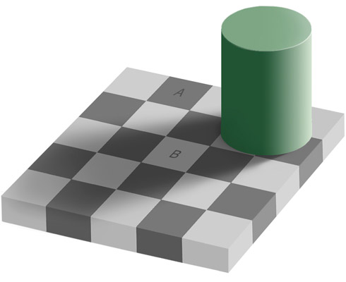
See the two different shades of grey on the A and B squares? Another trick question, because those squares are exactly the same shade of grey. This is so hard to believe that you might be tempted to save that image onto your computer and check for yourself. Try it! Or click here to see the deconstruction of the illusion.
Greg tells me that all of the cells on our retina that “detect” colours are connected. So what one cell “sees” is directly affected by what the cells around it see. In addition to that the brain tries to compensate for lighting conditions and often makes mistakes (like the second illusion above) when doing so.
Now, I’m not at all suggesting that we should be wearing grey checks and gradients. These optical illusions really just illustrate how colour perception is way too complicated to be represented by a single set of good colours. The important thing is that imperfections in our perception of colour open up many possibilities.
Here are three simple strategies that use the relativity of colour to make it possible to wear colours that aren’t on your list.
Combine Them with Your Best Colours
Recently I mentioned that although grey is not one of my best colours, it springs to life and becomes flattering if I wear it with a sour shade of citron and bright white. It’s like waving a magic wand over the grey. Same goes for a muted blush pink that only works when I wear it with a crisp pastel pink, tomato red, or black and white.
Wear Them in a Smaller Surface Area
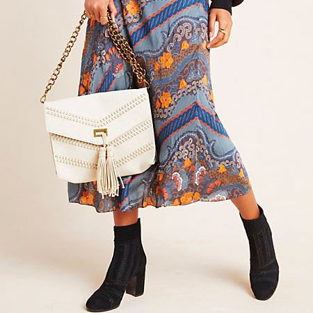
One of my clients loves black, but it does not love her back. She feels that it is harsh and aging against her complexion. So she sticks to wearing black on smaller surface areas like handbags, belts and footwear, keeping navy and shades of grey as her dark neutrals for clothing. She’ll also wear black when it’s incorporated into a pattern with her best colours like French blue, purple and teal.
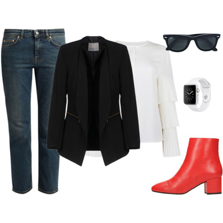
Similarly, I look awful in burgundy, but I will wear it in small surface areas when it’s incorporated into a pattern, like in the burgundy in this twinset.
Wear Them Away from Your Face
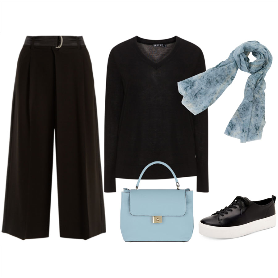
Wear colours that don’t look fab against your face on the bottom half of your body. One of my clients wouldn’t dream of wearing stone and dove grey as a top or topper because the shades wash her out and make her look sleepy. But she’ll happily wear them in a skirt, jeans, pair of trousers, or as footwear.
Think further than the confines of your prescribed colour palette. Your so-called “best” colours are merely a starting point. Like so much of the advice we hear about style, they should be seen as guidelines, not rules. You can wear pretty much any colour you care to if you wear it in the right way.