Back cutouts: yay or nay

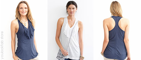
It’s somewhat predictable to show off the décolleté, especially if that’s a pretty part of your body. But how about bit of unexpected back exposure?  I vote yay. I enjoy seeing ladies wear garments with interesting back cutout detailing because it draws attention to a less commonly revealed part of the body.

Often our backs are in superb shape and we forget how gorgeous they are. Showcasing a lovely back is just as attractive and alluring as revealing a bit of beautiful chest. And if you’re bony in the chest area like I am, or if you have sun damage on your décolleté, your back might be a more comfortable way to expose some skin.

My yay vote comes with the caveat that I need to feel adequately covered. I still need to wear a bra with a backless garment and feel secure that my dress or top isn’t going to slide off my shoulders.  As with all revealing pieces, the amount of exposure has to be just right so that I don’t feel naked. With my short hair I tend to feel even more exposed because I don’t have cascading locks to cover up skin.

How do you vote? Would you wear an item with back cutouts? If not, can you appreciate the look on others?

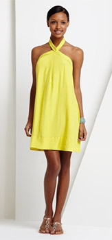
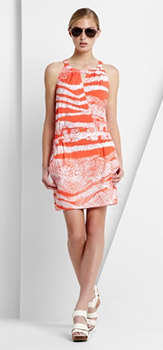
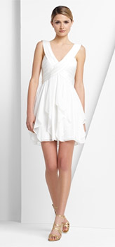
Marc Jacobs Diamond Zig Zag Dress Michelle Mason Open Spine Dress Theory Jacobi Dress

You’d get away with wearing the right style of bra with these backless styles and I like that important detail. It’s fun to make a dramatic exit.

Marie Claire combines plus size and nudity

Here’s a story combining two topics that generated a lot of discussion on YLF recently: plus sized models and nudity in the fashion media.

French Marie Claire chose larger models to showcase a bathing costume and lingerie line in their June edition. Quite refreshing. I enjoy seeing all sorts of body types represented in fashion shoots – after all, that’s the reality on the street.

Of course, the definition of “plus size” can be debated, but the models here are definitely a lot curvier than the norm for their profession.

We don’t see many larger models in fashion magazines so its newsworthy when it happens. This would not have happened 15 years ago, but the fashion world still has a long way to go if it wants all of its audience to feel like their body types are represented. I’m not sure they will ever get that part right, but I’m hopeful. Every year the media seems to be moving in the right direction with shoots like this and Lane Bryant’s recent television commercial.

Nudity is commonplace in European advertising, so it’s no surprise that one of the models is topless. She looks magnificent. Remember that this is French Marie Claire and it’s common for ladies to tan topless in France, so this type of coverage probably doesn’t kick up any fuss over there.

I originally read about this in the Huffington Post, but proceed with caution because the article contains images that might not be suitable for your work environment. Be especially careful if you work in Investment Banking.

Breaking patterns into a wardrobe

I have clients who are adverse to wearing any form of pattern. They either stick to solids because that’s their style preference, or they’re completely overwhelmed with pattern choices so it’s easier to go without.

The world of pattern choices can be overwhelming because there’s just so much out there. And on top of it all, pattern preferences are very personal.

If you like a pattern-free wardrobe then that’s okay. You don’t need to wear patterned clothing to have a great sense of style. But what do you do when you want to wear patterned items but don’t know where to start?  Here are the baby steps that I suggest to my clients:

  • Start with your favourite colours: So if you like blues and greens, start with that colour palette. Alternatively, choose a pattern in your favourite neutral tones.
  • Start with a small geometric pattern: A dainty geometric tends to be the most neutral, simple and safe option.
  • Keep it subtle: Avoid patterns with big, bold shapes and colour contrasts. That’s pattern graduate school. Instead, turn to patterns with softer designs and low colour contrasts.
  • Choose a spaced pattern: Most patterns are continuous, evenly covering most of the background colour. Spaced patterns, on the other hand, cover less of the background and are  often easier on the eye.

You can apply all these guidelines at once, or just a few at a time. You might find that you stick with subtle, low contrasting, geometric patterns, and that’s fine too. No need to wear big bold florals and abstract patterns if that’s not your thing.

I’ve been wearing patterns forever and happen to like big bold patterned garments, especially when they’re geometric and make a simple yet strong statement. Although I can appreciate just about any pattern on other people, I’m still quite fussy about the actual designs I choose for myself.

How about you? Did you have to break patterns into your wardrobe slowly, or have you been a pattern wearer most of your fashion life?

Flutter Top with Print in Cream and BlackGrace BlouseZebra Print Sleeveless Wrap BlouseDVF Marroca Top

The first pattern is a high contrast floral design, but neutrally toned and spaced. The second is subtle, geometric and neutrally toned too. The third pattern is an animal print design, but still fairly subtle and geometric. The first three examples show how to take baby steps with patterns. And then there’s the fourth pattern which is bold, bright and very busy. That one’s for pattern graduates!

Roundups

Simpler Items

This week's list of top picks list is about basic pieces.

Read More

Assorted Items

Items for Summer, both in and out of air conditioning.

Read More

Casual Summer Vibes

This week's top picks are good for a casual Summer vibe.

Read More

Summery Earth Tones

These items are for those who like to wear casual earth tones in warm and hot weather.

Read More

Hints of Spring

Some tried-and-tested winning items to refresh your style for Spring.

Read More

Dressier Items

An assortment of dressier top picks might be just what the doctor ordered.

Read More

Be Stupid: Diesel’s eye catching campaign

Italian denim house Diesel has great stuff so I give their collections a once over each season, both for myself and for Greg. Sometimes we walk away with fab pieces and sometimes we walk out empty handed.

But I don’t understand their advertising and this year’s “Be Stupid” campaign has me stumped. Each ad is a funny or irreverent image that accompanies a statement about so called smart and stupid thinking. Here are a few examples:

There are many more and you can see the entire “Be Stupid” campaign at the Coloribus advertising archive (note that some of the content might not be suitable for work).

Some of the ads are funny, some are cute and others are just beyond me. Every young generation has a rebellious element that is very aspirational, and perhaps this is Diesel’s attempt to tap into it. “Smart” has been defined by the establishment, so “stupid” must be cool. Or maybe they are trying to encourage uninhibited creative thought, because sometimes crazy ideas can become fabulous ideas.

I’d like to hear your views. Maybe I’m missing the point entirely, which I guess would make me stupid. But according to Diesel, that’s cool.

Diesel's

Leggings as sleepwear

Extra soft cotton-rich leggings paired with a T or tank might be your answer to comfy sleepwear. Roomy long-length or three-quarter-length pajama bottoms look adorable, but if you’re like me, you can’t stand the way they creep up and bunch while you are sleeping. Totally uncomfortable and sleep depriving. Leggings stay put because the leg is tapered. Does this sound like a good idea?

DKNY Abstract Stripe Leggings DKNY Oversized Logo Sleep Tee