Team Knit Top or Team Blouse

This poll needs a little clarification. A knit top is not a  basic T-shirt or item of knitwear (or sweater), but a more styled top made of jersey knit. A blouse is not a button down shirt, but a woven top usually made of cotton-silk blends or rayon-viscose blends. A knit top is made of knitted fabric while a blouse is made of woven fabric.

I am down to one knit top in my wardrobe so I’m on Team Blouse. I wear knitwear, button down shirts, or blouses. I do not wear T-shirts and very occasionally wear my one and only knit top. My style is quite dressy and “buttoned up”, which makes the crispness of a blouse work better than the more casual vibe of a knit top.

Although knit tops are the comfortable choice for most women, surprisingly, I’m more comfortable in a soft blouse. Plus I have a thing for the luster and longevity of woven fabrications and much prefer them to knits. Always have, always will.

Over to you. Are you Team Knit Top or Team Blouse? Tell us why. You’re on the bench for this poll if you never wear separates or live in T-shirts, sweat tops and knitwear. No batting for both teams please!

Dolman Sleeve Tops are Fab

Dolman sleeve tops made my 20 must haves list for Autumn/Winter 2010 because they look refreshingly “new”. Sure, some of us wore rather awful chunky knit dolman sleeved pullovers in the 70’s, and neon shoulder-padded versions in the 80’s, but that shouldn’t stop us from wearing the improved incarnation 25 years later. The right dolman sleeve top is more flattering and forgiving than you might expect. Some styles are great at concealing muffin top.

Dolman sleeve tops are voluminous yet sleek, and modern yet retro. The kind of shape that works for many different body types when the right silhouette is selected. Surprisingly, a dolman sleeve top can soften a strong shoulder line as well as strengthen a weaker one. So the shape works equally well for inverted triangles and pear shaped body types. Petites should watch the excess volume under the arm, but should by no means stay away. A more streamlined version of a dolman sleeve top will not swallow you up.

There are no hard and fast rules, but if you are struggling to find the perfect dolman sleeve top, the following guidelines might help:

  • Soft fabric: Woven drapey silk and rayon blends for blouses are ideal because the fabric collapses close to the body. Fine gauge knits and jersey knits work well for the same reason. Dolman sleeves in chunky knits on the other hand, are harder to wear and almost impossible to layer under a coat.
  • Volume under the arm: The excess fabric under the arm is what makes this style unique. If you’re petite, full busted or strong shouldered, keep the volume fairly subtle. Also, if you like to layer over a jacket or coat, keep the volume subtle too. Less bunching.
  • Neckline: Lasses with fuller bust lines should choose a wider scoop, cowl or V-neck.
  • Sleeve length: A voluminous sleeve which does not taper at the hem works best when its short. I’ve found that my strong shouldered clients look exceptionally good with short sleeved dolman sleeve tops.
  • Tapered sleeves: Dolman sleeves that taper at the hems are often more flattering because it structures the volume. Scrunch up the sleeves for textural outfit interest.
  • Tapered bottom: Dolman sleeve tops with banded bottoms are also easier to wear because they balance out the excess fabric of the sleeve and “ground the style” so to speak.
  • Length: Both tunics and regular length tops will work. Tunics work particularly well with slim cut bottoms, whereas regular length dolman sleeve tops work well over skirts and bootcut pants or jeans.


I have several dolman sleeve pullovers that I wear with skinnies tucked into boots because they happen to be tunic length. But regular lengths in fine gauge knits work well over pencil skirts and boot cut pants – a nice business casual look. These tops also look great belted if you prefer a defined waist.

The dolman sleeve tops pictured are all tapered at the hems and sleeves because I’ve found those styles easiest to fit on most body types. The volume under the arm isn’t excessive either. So far, I haven’t had a disappointed client in the right dolman sleeve top! Are YOU sold yet?

Wardrobe Items You Hope to See Under the Christmas Tree

Shamefully, I’ve already thought about a few wardrobe items I’d love to find under our Christmas tree this year. Any one of them would be greatly appreciated:

  • A bright chestnut cropped leather jacket
  • A structured yellow handbag
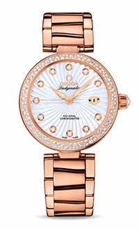
  • An oversized gold watch

Over to you. What’s on your wardrobe item wish list for Christmas? If you don’t celebrate Christmas, perhaps you have another occasion that involves gift exchange and you can tell us about what’s on that wish list.

Roundups

Simpler Items

This week's list of top picks list is about basic pieces.

Read More

Assorted Items

Items for Summer, both in and out of air conditioning.

Read More

Casual Summer Vibes

This week's top picks are good for a casual Summer vibe.

Read More

Summery Earth Tones

These items are for those who like to wear casual earth tones in warm and hot weather.

Read More

Hints of Spring

Some tried-and-tested winning items to refresh your style for Spring.

Read More

Dressier Items

An assortment of dressier top picks might be just what the doctor ordered.

Read More

Meeting the Miz Mooz Team

Last month, while in NYC  for Fashion Week, Greg and I popped into the offices of Miz Mooz located on a bustling Broadway Avenue. If you aren’t familiar with this fabulous footwear brand, read about them in this recent product review. Our readership is as enamoured of their fun colours, retro styling and cushioning footbeds as I am.

The Miz Mooz showroom and head office is located behind one of their stores, which in itself is fabulous. Can’t get closer to your customer than that! So we walked through the store first in order to get to the showroom. There we were met by delightful employees, Cheryl Matson and Jeffrey Bart, who made us feel right at home. I couldn’t resist wearing my own red Miz Mooz Alcott pumps to the meeting. Needless to say they received a standing ovation.

Miz Mooz runs an impressive and tight operation. You’d never guess that aside from retail staff, the entire company is seven people, and the oldest employee is 30. Quite the young and dynamic bunch.

Cheryl and Jeffrey ran us through both their Fall and Spring collections and I was in my element. The experience took me back to my buying days as I handled all sorts of samples and prototypes. So fun! As I browsed the showroom racks, I couldn’t help but shout out: “Those are in the YLF store!”, and “Oh! I have the apple green Carlitos. I love them because they are hip and comfortable!”, and “I have a friend who bought those boots in both colours because she liked them so much!”  What can I say? I’m a fan.

I asked about the origin of the unusual name and chuckling followed. Well, it turns out that aside from having a nice ring to it, “Miz Mooz” is a play on the Hebrew word for foreplay: “Meez Muz”.

The name is not the only Israeli connection. Miz Mooz also draws from Israeli footwear brand “Gazith”. According to Cheryl, Gazith is more of a sister brand than the Israeli Miz Mooz brand. “Our shoes share the same inspiration as Gazith, but we alter the line significantly to make it more suited to our market, and add our own styles. The Israeli shoes are a bit more… extreme!”

When I traveled to Israel last year, I did notice their fearlessly fashion forward footwear. I guess it makes sense to tone things down to suit the American market.

Cheryl explained that the unique distressed look of Miz Mooz footwear is created in a finishing process. “Whereas most shoes just work their way through the production line and are then placed in the boxes and shipped to customers, we have a team at the end of the line that polishes or distresses the product to the desired look, be it an extreme distressing with sandpaper or just a light burnishing with polishes. Each pair gets its own unique look through this process. It is a traditional way of making shoes — more hands on and less automated. We feel this process adds so much character to the product”. It does indeed.

The most interesting piece of information that Cheryl shared with us: black is their worst selling colour. “People don’t want to buy black footwear from us”. It makes sense. Why purchase black Miz Mooz shoes when you can choose from an abundance of happy colours. On that note, the next pair of Miz Mooz shoes on my shopping list are the Ansel oxfords in green or the Histeric oxfords in chestnut.

Another nugget to bear in mind with gift giving season around the corner: Miz Mooz recently launched a small menswear collection.

Our last stop before leaving was a wall of previous ranges. It was a great illustration of all that this little company has achieved in a short space of time. We look forward to many more winners from Miz Mooz.

Gap’s New Logo, or is it?

Has anyone noticed Gap’s new logo? I must admit that I hadn’t until Greg brought it to my attention. The new logo was launched on Gap.com about a week ago. The typeface is Helvetica, which many designers regard to be over used, and there is an awkwardly placed blue square behind the end of the word. Now compare that to the outstanding branded logo we’ve identified with Gap for over 20 years – crisp white writing within a clean blue square. There’s no comparison.

I perceive the Gap as the quintessential American Store and identified strongly with their old branding. It is distinctive and simple. The blue and white combination was wholesome, clean-cut and denim friendly. In a sense, timeless. Very “Gap”.

At the same time, I realize that I can be resistant to change. Is that what this is all about? Is the passionate and widespread disapproval of the new logo just the result of us all being so attached to the old logo that we can’t accept a new one?

As a result of the new logo’s negative reception, Gap’s management has said that they are open to input. They have asked the public to share their design ideas through a crowdsourced contest. Well, that move made the professional designers angry! If you want killer logo design, you have to pay professionals to get it – don’t ask the public to slap it together for free using PowerPoint. Oh heavens. What a mess.

I understand that the evolution of a logo is a necessary part of a retailers journey. But perhaps Gap’s logo change should have been more subtle because, like me, many people become attached to branding that has become an institution. What do you think of Gap’s new logo? Do you prefer the old one? Do you even care?

Update: As Ana pointed out in her comment below, Gap has apparently reverted to their original logo.