Phase 2 of the YLF Redesign: The Phone

In mid March we launched the YLF redesign. One of the features we highlighted then was what we call “Modes”, which lays out the site differently when the browser window is different sizes. The modes are also aware of the iPad, putting the site in narrow mode when the iPad is held in portrait orientation and in wide mode when it’s in landscape orientation.

Angie explained in her launch post that we were also working on a 3rd mode that would make the site easy to use on the smaller screen of a smartphone like the iPhone, Windows Phone or one of the many Android phones. As of a few minutes ago, this 3rd mode is now enabled, and if you browse to YLF on your phone you should see the new layout.

If you don’t have your phone handy, here is the difference you will see on the forum front page. The new phone mode is on the left.

Forum Before & After

If you would prefer YLF on your phone to look exactly like it would on a computer or the iPad, then scroll to the bottom of any page and click on the tablet icon (that’s the one on the right below). You can also switch back to phone mode by clicking the phone icon on the left. YLF will remember your selection for about one month at a time.

Selector

There are many little differences between the phone mode and the original narrow and wide modes. In some cases things that were in the sidebar on the right are now in the main column. In other cases some non-essential information is left out. It has a different photo viewer that is more suited to a small screen. Phone mode is also a little more like an app in that you can’t zoom in and out.

We have tested the new phone mode quite a lot, but there are many, many phones that we have never even used. So please let us know if you come across any issues. Also, let us know if anything is still hard to use. I’m sure we will need to make refinements.

Enjoy!

The YLF Cover for October

Forum member RoseandJoan suggested a backstage post on how we selected the October cover (or background image). That sounded like a fun idea, so here it is.

Before we made the final decision to implement the chameleon feature we brainstormed a list of potential covers for every month of the year. We wanted to make sure that the ideas wouldn’t dry up after the first month or two. In a few minutes we had a long list of possibilities and the confidence that we could easily find something interesting for each monthly cover. Fashion is so visual, and you can also throw in things like the seasons that are so relevant to what you wear.

For October I really wanted to feature the changing leaves because Autumn colors are one of the things that makes the season Angie’s favorite. A few days ago the weather was nice, so with camera in hand and two Autumn-y scarves we set out to find a nice backdrop. We found the first possibility in Powell Barnett Park near where we live and got some nice shots. The light was catching the tree in a great way, and the blue sky was great with Angie’s denim jacket.

Angie then had the idea that we could use a photo of her Frye boots in amongst the Autumn leaves. She helped nature a bit by collecting some of the red leaves and scattering them on the ground where she stood. It was a great idea, but the photos I took let it down. Although the picture below looks quite nice, none of the photos were good enough when enlarged to the size we need for a background. Still, we used one of them in the September newsletter.

For a third option we went to the nearby house of our friends Phoebe and Marcus. A week before I had noticed that the Japanese Maple in their garden was looking like the perfect backdrop for the October cover. This third set of pictures was probably the best in terms of lighting and the richness of the colors, but we just couldn’t get it to work as a background. The deep Autumn hues made the background too overpowering.

Getting the photos is actually one of the easier steps in the process of creating the background. Although there are a few hundred photos to sift through, it doesn’t take long to get down to about 10 candidates. Then it’s a matter of experimentation. I put together a template to make things efficient in Photoshop, but it is still tricky to find the right part of the right picture. A background that will enhance the experience, but won’t draw too much attention to itself. In this respect the October cover is an improvement over the one we launched with in early September.

There are many other details to think about. For example there must be a fairly natural way to ease from the picture into a block of color further down the page, and the text in the header must be readable when it is superimposed on the background. Finally, I have to cram this large image into a small file that doesn’t take too long to load. Many years ago I wrote software that compressed images so I know a few simple tricks that make this possible.

All this takes time. I have done about 20 backgrounds so far and many of the opportunistic ones were very quick. I saw a picture and thought, wow, that will make a great background. And often it did. But the ones like the October cover where we started with an idea take much longer. We think its worth it because it has quite a big effect on the feel of the site. If we do it well, the site feels familiar, but fresh.

Tweaks: Front Page Layout and Hiding Photos

I love the iterative nature of developing for the Web. Unlike packaged or downloaded software where there is a lot of overhead in releasing an update, it is very easy to make a small change and take it live. This means that it’s possible to experiment with things and respond quickly to customer feedback or your own new ideas.

An excellent example of this in action was our launch of roles and awards a few months ago. We got some great feedback on the new features and were able to use the input to make huge improvements to the system almost immediately. I LOVE that.

There are also things we need to change about the new look YLF that we launched a few weeks ago. Lots of little things, some of which we’ve dealt with already like text that was a bit light in some places. But also two bigger things: (1) the layout and content of the front page, and (2) allowing members to hide their photos.

Front Page Layout

First of all, why did we change the front page to begin with? A blog is a tried and tested format. Well, the main reason has to do with the frequency of updates. The blog format has the problem that it changes too slowly AND too quickly.

  • Too Slowly: At YLF we publish two posts on Monday to Thursday, one post on Friday and the occasional post over the weekend. Between those times the old site stayed pretty static. That seemed wrong given the hive of activity on YLF.
  • Too Quickly: Sometimes there are things that you want to focus on for longer than half a day. With the old site that was hard to do. You could get a lot of attention on something by posting on the blog, but as soon as the next post went live it dropped below the fold. In this sense the blog changes too quickly.

We saw the front page as an opportunity to address this. The new activity stream surfaces things that you do in the blog, forum and store in realtime as you do them. And the new feature allows us to focus on a topic for longer than half a day, highlighting relevant info in the blog and forum. Fashion week was the first feature, but Angie’s new one on the Autumn Transition will be an even better example. It will point to previous blog entries, new blog entries that Angie publishes over the next week, and related threads in the forum.

What wasn’t working for us in the version we launched on September 6 was the prominence of the blog content in the front page, or rather, the lack thereof. Sometimes we will need the feature to dominate the page, but this won’t always be true. So we now have a design that will allow the feature to be different sizes according to its importance. We have also restored the main blog post of the day to its rightful prominent position at the top of the page.

Finally, we’ve enhanced the activity section with an area for recently started conversations that include pictures. We know that people love photo posts and this is an easy way to discover them.

Photo Upload Management

Before the recent launch of the new site we tested it with a very small group of beta testers. We got some great input that we incorporated before launching, but there was one feature we agreed was important but just weren’t able to do in time: the ability to manage your photo uploads (and specifically, to delete them) outside the post editing form. This is necessary because forum posts can only be edited for 24 hours after posting.

So today we are adding a simple way to hide photos after your ability to edit the post has passed. If you hover over a photo in your post you will see the option “Hide Photo”. Click this and other people won’t be able to see the photo when they read your post. It is easily reversible —  the option will immediately change to “Show Photo”, which you can click to make the photo visible again.

It sounds more complicated than it is. Just load a thread where you have posted a photo and give it a try. Hover over the photo, press “Hide Photo”, then log out and view the page as someone else would see it.

This is certainly not the last word on photo management, but it gives you control over the visibility of the photos you upload. We will add more photo management features over time.

Note that when you hide a photo, a blank placeholder remains in the post where it appeared. This must happen because in the post text you might have referred to the photos by number and we don’t want all of those references to break when you return and hide photos at some point in the future.

It’s About the Little Things

You might also notice other little changes. Most of these are the direct result of your feedback, so thanks very much for caring enough to speak up. And keep it coming! Use the contact form, send me a private message or start a thread in the forum.

Designing YLF’s New Persona

Why on earth would we create this backstage blog when we could post everything on the main blog? Well, so that we can post completely indulgent blog entries like this one. Most people won’t be interested in the thought process that led to the new look YLF, but for those who are, here it is in way too much detail.

Since we launched YLF in 2006 we have evolved the style and persona of the site with each update. Sometimes we added big new features, but the look and feel of the site was always true to the original blog. That changes today.

YLF is reaching a new stage in its life and it needs a new style to go along with that. Here are our main goals and the specific aspects of the design that tackle each one.

Chameleons and Context

Visually, we want the site to be a chameleon for the “now”. If the topic is the color palette for a new season, we want the site to be painted in those colours. If we are posting about fashion week, we want you to feel like you are immersed in the action. So the background image will sometimes be tailored to the page you are looking at. We are currently planning to use these special backgrounds in two ways:

  1. Special blog entries: When we have a visually rich blog entry that lends itself to a fancy background we will give it one.
  2. A monthly “cover”: All the pages in the site (except the blog entries that have their own special background) will use a single background that we change from month to month.

We hope you find the result as immersive and exciting as we do. Of course the very first example of this is the background we have chosen for September and the launch of the new design. And here are a few examples of this in action for previous blog entries:

Community Front and Center

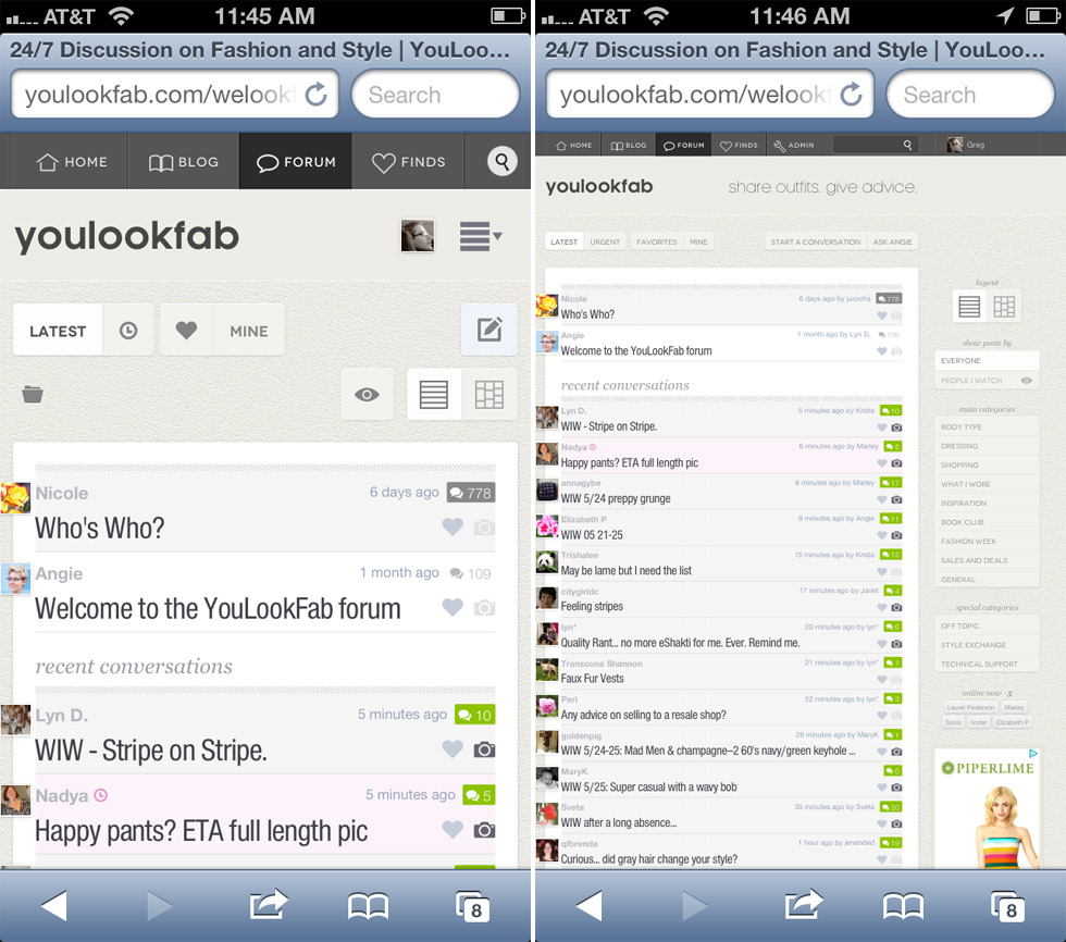
We want the things you do to be more prominent. We love the blog, but YLF is not only a blog these days. About 6 months ago the pageviews on the forum started to exceed those on the blog and since then the gap has widened. So instead of the front page being a blog alone, we wanted it to highlight activity from all over the site.

There are two ways the new design achieves this:

  1. Front Page Features: on the left of the front page you will see either one or two big feature slots. The features will run for a few days, or even a week, bringing together posts from the blog, discussions in the forum and other information like relevant twitter feeds. Our very first feature is about the new design, but the next one will be even more fun: September Fashion Week in NYC!
  2. The Activity Stream: Almost everything that happens on YLF (posting a new blog entry, replying to a conversation on the forum, reviewing something in the store) now gets registered in the YLF activity stream. The last 10 or so entries will always be displayed on the front page. We hope this will bring all the exciting stuff that used to be buried deep in the site to the surface.

Fashion Mag or Web App

One tension that we’ve tried to embrace is the duality of being a sort of fashion magazine and at the same time a social web application. On the one hand, we’ve tried to convey fashion mag with a large distinctive title in the “masthead”, a colorful photographic “cover” in the background, and a crisp white “page” with classic typefaces like Helvetica and Georgia. On the other hand, we’ve tried to emulate the web apps we admire in their clean design with lots of white space and a clear layout.

Beyond the aesthetics, this isn’t an easy marriage from an information design point of view either — high end magazines are an intentionally rich, dense, and complex treasure trove that most people consume in tiny chunks. Great web applications, on the other hand, are sparse and simple, with everything close at hand. Our approach is to make the essential elements of the site, like posting in the forum and navigating the store, obvious and simple. But also putting the richness of the content — years of blog entries and intense daily activity — out on display but less prominent. Hopefully once the basic stuff becomes second nature, people will start to notice all the other possibilities.

Coming of Age

The original YLF represented Angie’s first foray into communicating her expertise to a broad audience, and my first experiments with web design and development. Since then we have come a long way, and as our baby grows up we need to let go of of a few things:

  • The prominence of the “YLF colours” that we love so much must give way to a neutral palette that supports whatever the current topic demands, whether that be the new Spring colours or the vibrant colours of Hong Kong.
  • Lisa Henderling’s beautiful stylized caricatures must give way to photographic content — both ours and yours. Photos have become more important over time and now they will start to play a central role in the design of the site.

It was hard for us to let go of these things. We have several design explorations that attempt to combine the old characterful design with a neutral one that celebrates photo-rich and user generated content, but they just didn’t work.

One way that I test new designs is to be very conscious of my reaction when I see them unexpectedly. Like when I unintentionally catch a glimpse of it on my screen as I walk past our home office, or when I’m surprised by it when my Mac laptop springs to life. There is a brief emotional response before the frontal lobe steps in to tell you what you think. None of the compromise designs passed this test.

After we did let go, everything fell into place. My first feeling when seeing the design was a rush of excitement and an urgency about getting it out there. It was the same for Angie.

So, out with the old. In with the new.

Continuity and Identity

While a lot is changing in the design, a lot is also staying the same. To ensure continuity we have worked hard to ensure that it will be very easy to feel at home in the new design. Most of the things that are used heavily, like features in the forum and navigation in the store, still work the same way.

More importantly, when I think about YLF’s identity, two things come to mind. The nature of the community and Angie’s personality. These things define YLF and they are not changing today.