In mid March we launched the YLF redesign. One of the features we highlighted then was what we call “Modes”, which lays out the site differently when the browser window is different sizes. The modes are also aware of the iPad, putting the site in narrow mode when the iPad is held in portrait orientation and in wide mode when it’s in landscape orientation.
Angie explained in her launch post that we were also working on a 3rd mode that would make the site easy to use on the smaller screen of a smartphone like the iPhone, Windows Phone or one of the many Android phones. As of a few minutes ago, this 3rd mode is now enabled, and if you browse to YLF on your phone you should see the new layout.
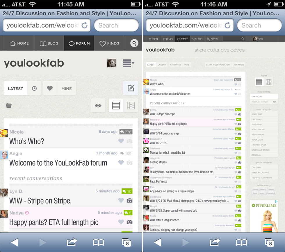
If you don’t have your phone handy, here is the difference you will see on the forum front page. The new phone mode is on the left.
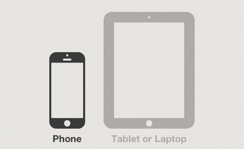
If you would prefer YLF on your phone to look exactly like it would on a computer or the iPad, then scroll to the bottom of any page and click on the tablet icon (that’s the one on the right below). You can also switch back to phone mode by clicking the phone icon on the left. YLF will remember your selection for about one month at a time.
There are many little differences between the phone mode and the original narrow and wide modes. In some cases things that were in the sidebar on the right are now in the main column. In other cases some non-essential information is left out. It has a different photo viewer that is more suited to a small screen. Phone mode is also a little more like an app in that you can’t zoom in and out.
We have tested the new phone mode quite a lot, but there are many, many phones that we have never even used. So please let us know if you come across any issues. Also, let us know if anything is still hard to use. I’m sure we will need to make refinements.
Enjoy!