After yesterday’s post on the directional trends that are changing the world of fashion and style in important ways, it’s on to colours and patterns. Remember that colours go beyond wardrobe items to make-up, nail polish, and hair colour.
Brights
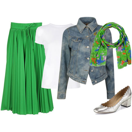
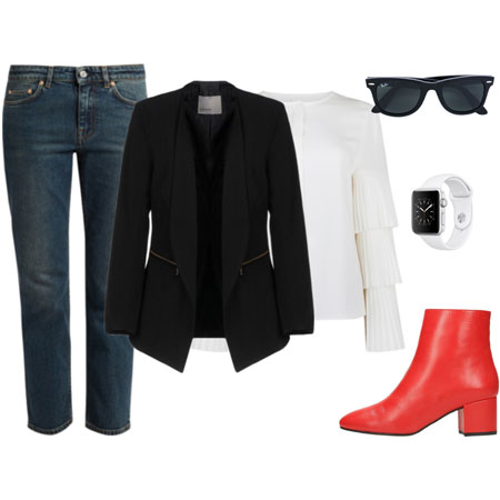
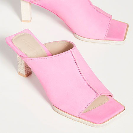
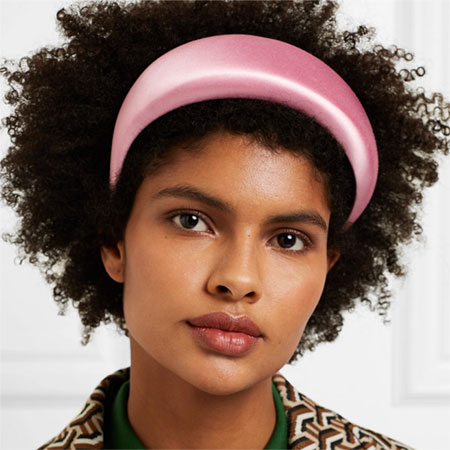
The ‘80s influence on today’s fashion brings with it bright red, orange, shocking pink, shades of yellow, chartreuse, and emerald green. There’s a sprinkling of neon, watermelon and lime green too. If you’re adventurous with colours and have a high affinity for colour mixing, you’ll find these brights easy to remix with neutrals, pastels and other brights. There is an emphasis on bright-coloured footwear.
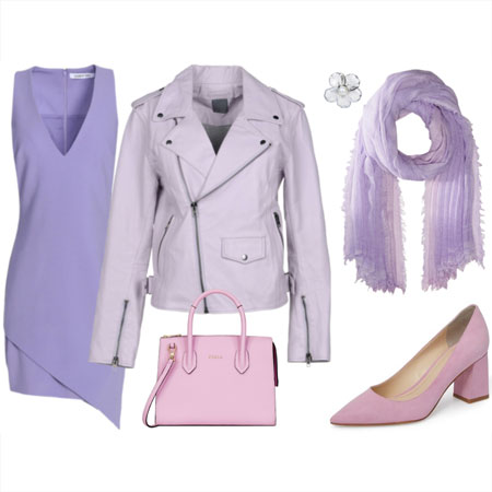
I also see shades of lilac, purple, orchid and teal coming through, so all is not lost for jewel tone lovers. Teal footwear is on the rise. There is blush, seafoam and mint for pastel lovers.
Blues
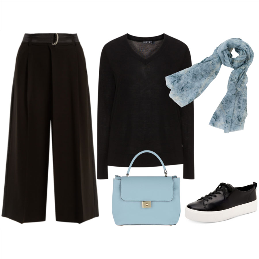
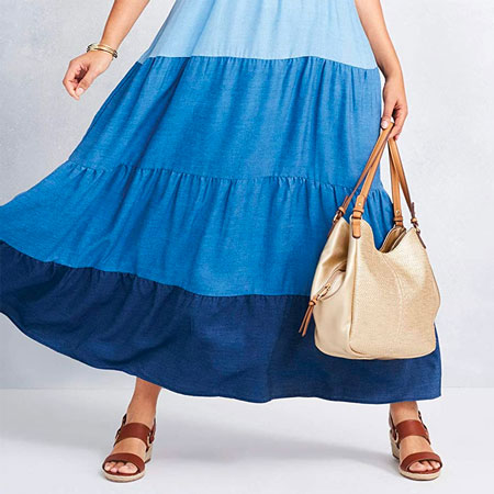
Shades of blue in solids and patterns are everywhere, with an emphasis on navy, cobalt, turquoise, light blue, and all washes of blue denim. Acid wash denim makes a nostalgic comeback. Shades of blue are extremely versatile and can be combined with every neutral and non-neutral. Dark blue shoes are mainstream, and light blue shoes are more fringe. Both look smashing with a matching bag.
Neutrals
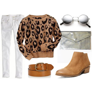
Since the ‘90s are trending, we’re going to see a lot of black and tan clothing, footwear and accessories. There is a lot of monochromatic black and white dressing. Grey takes a backseat to shades of tan as a nod to the Utility Pretty and Safari Chic vibes. Shades of white continue to exude a modern and fresh crispness, and white footwear is here to stay. Wearing white from head to toe is big too.
Earth Tones
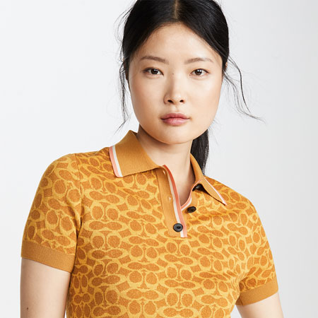
Earth tones continue to trend as a nod to the ‘70s. Think spice colours and all sorts of browns, like mustard, turmeric, burnt orange, cognac, chestnut, saddle, toffee, coffee, cinnamon, milk chocolate, dark chocolate, saffron, taupe, khaki, stone, maize, olive, burgundy, bronze, tortoiseshell, gold, and animal patterns in these earthy shades. Remix earth tones with ANY palette. Personally, I like to cool them down and crisp them up with white and shades of blue. They also look great with solid black.
Pattern Mix
Complementary and clashing pattern mixing has become an important part of our fashion era because it’s one way to be maximal, creative, look interesting, and make wardrobe items more versatile. You can pattern mix in subtle or bold ways. These days, most patterns can be worn together if there are cohesive elements in the outfit pulling the look together. Patterns that share the same colour palette are generally a good match and easiest on the eye.
Bohemian and Botanical
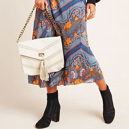
Colourful ‘70s bohemian patterns and paisley are popular in dresses, scarves and tops. Tropical and botanical patterns are a nod to ‘90s Safari Chic, which is when we saw leaf and foliage patterns galore. These patterns can be bold or subtle, and neutral or non-neutral.
Polka Dots and Interesting Stripes
Polka dots and stripes are as strong as ever. Polka dots in all sorts of variations are trending, although I think of them as an iconic classic in two-toned symmetrical neutrals. Large, small, irregular, symmetrical, neutral, non-neutral, two-toned, multi-toned — you name it and it’s there. Sport a polka dot accessory if wearing polka dot clothing feels off.
We see horizontal stripes in all sorts of classic iterations every season. Boring to some, and signature to others. Stripe variations are also coming through. Think pinstripes, variegated stripes, vertical stripes, multi-coloured diagonal stripes, and stripes remixed with other patterns.
Florals, Tie-Dye, Gingham
It wouldn’t be a ‘90s inspired season without a good dose of dainty ditsy and Sanderson florals. The ‘70s influence brings a good dose of tie-dye. Gingham makes its preppy ‘80s comeback, and abstract florals are very now. You’ll see these types of patterns make their biggest statement in dresses, blouses, skirts, soft flowing wide pants, tailored pants, and scarves, both in dressy and casual renditions.
Columns of Colour and Tonal Dressing
Wearing a column of colour means wearing the same colour from head to toe. It can be ANY colour, so neutrals and non-neutrals. Tonal dressing means wearing an outfit made of items that fall within the same colour family, or are close together on the colour wheel. Again, these colours can be neutral or non-neutral. It can mean wearing different tones of one colour like blue. Or it can mean wearing colours that are quite similar like various shades of red and berry from head to toe.


I like the bright non-neutrals of the season, and the emphasis on white as a neutral. I love wearing bright columns of colour, and plan to wear a Spring and Summer column of citron when I find the right citron bottoms or dress. I enjoy tonal outfits that combine brights like red, orange and shocking pink. I like pattern mixing, and wear many shades of blue. And my thumbs are up for polka dots, stripes, gingham, and abstract florals.
Over to you. What do you think of the season’s colours and patterns?