Spring colours are on my mind after seeing the 2013 collections at New York Fashion Week. I’m in the midst of watching the shows at London Fashion Week, and thereafter it’s Paris and Milan. The colour direction is becoming clear and I’m excited about it. There will be lots of variety, just like there is this year. That’s always a good thing because there will be something for everyone.
Here’s how I see the colours for Spring and Summer 2013 shaping up:
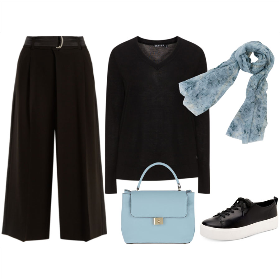
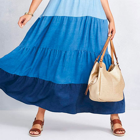
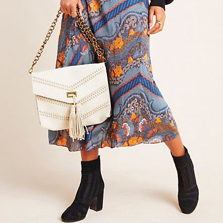
- Blue is going to be big, from pastel shades and mid tones, to cobalt, French navy and ink blue.
- If blue is the colour of next season, white is the runner up. All shades of white are matched with every colour and neutral, or worn on its own from head to toe.
- Pale shades of yellow are mixed with the blue and white.
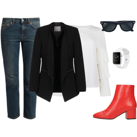
- Black and white is strong like it is almost every season.
- Shades of blush, linen and taupe are mixed with white, black, pastels and brights.
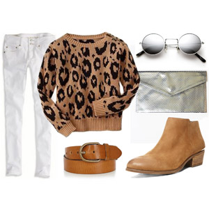
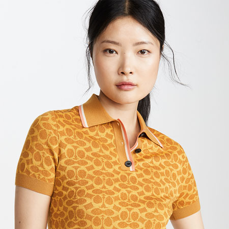
- Light earth tones make a lovely debut. Think rich, spicy, earth tones diluted with white.
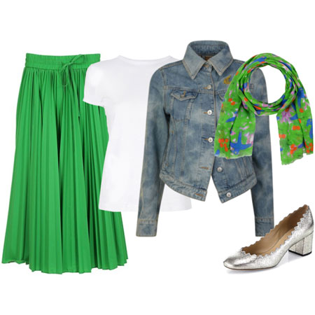
- Brights like poppy red, fuchsia, citron, lime green, emerald and violet make another great return.
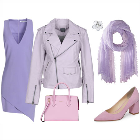
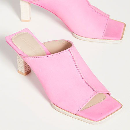
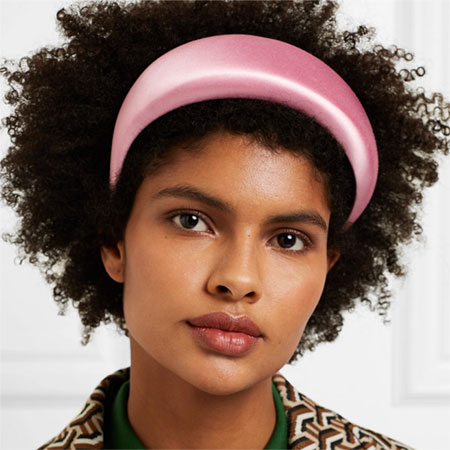
- Pastel pink, peach, mint and lilac are there, but in smaller doses.
Check out Pantone’s colour report for Spring 2013 for more on next season’s colours. Pantone has selected ten colours that they think are most important for the season. Of course, they expect there to be many variations on each colour, along with neutrals like white, grey, black and metallics.
How do these colours and their combinations grab you?