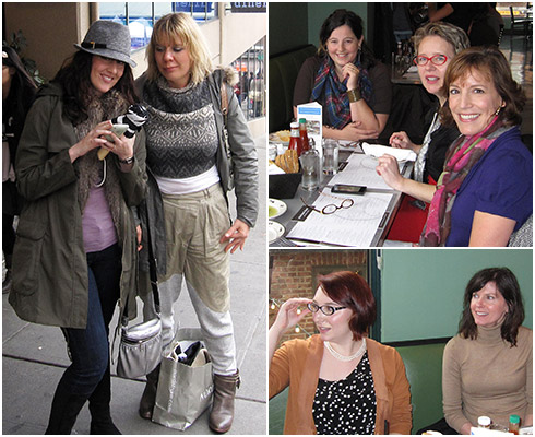
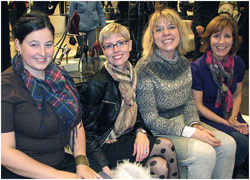
Today’s post is written by wonderful Veteran forum member and Seattle local Kari from InKarisWardrobe. Kari is a full time HR professional with fabulous style. Her colourful wardrobe matches her cheerful persona and beautiful smile! Kari recently organized a Seattle gathering and we had a ball. We virtually laughed from start to finish!
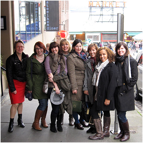
 On a drizzly Saturday morning, nine YouLookFab members and friends braved weather, traffic, and family commitments to gather in downtown Seattle. We chose to start our day at Nordstrom, and it was a thrill to spot Jenava, Julie (julijuli), Anna (annagybe), and Angie already engaged in animated discussion. It is so fabulous to meet online friends in real life, and then find that you hit it off even better in person!
We walked over to the Steelhead Diner – a restaurant Anna had suggested that is located just above Pike Place Market – where Antje, Shanette (sinead), and new moms Laurel and Phoebe joined us. Some of us had met before, but most were seeing each other in person for the first time.
During a fun and energetic meal, we barely took a break from our laughter to eat. Several of us discovered that we work in similar fields or share common career goals, and many found that they actually live near to one another. Angie entertained us with a hilarious story about misadventures while shopping in a Parisian retail store, and the table was soon buzzing with stories of our various travel experiences. Antje generously shared a delicious, large slice of chocolate cake with all of us.
I couldn’t resist snapping photographs throughout the meal – so many smiles, and such exuberant expressions to capture! Julie has an absolutely dazzling smile, Anna and Antje have genuine and contagious laughs, and Angie is so incredibly expressive when she is talking and gesturing.
Looking around the table, I was amazed at the very distinct representations of different styles – from sophisticated and elegant Shanette, to Jenava’s ability to perfectly pair contrasting items, to colorful and quirky Antje, edgy Anna and urban Laurel. I was mentally taking style notes. What an inspiring group!
Due to the damp weather, boots and patterned scarves ruled the day, and many eye-catching handbags made an appearance (such as Phoebe’s animal print bag, and Laurel’s structured green vintage purse, and of course the famous Valentino.)
Anna had brought an item that she greatly wanted feedback on: her Vince shearling aviator jacket, which you may have already seen on the forum. Anna wasn’t initially sure whether the jacket was a keeper, but after receiving a KILLER rating on the quality and fit from Angie and from the rest of us, she happily opted to keep it. The leather is buttery soft, and the jacket fits Anna and her trendy, fashion-forward style to a T.
After wrapping up our lunch, some had to depart, but others were ready for a little shopping. I had never had the pleasure before to really shop with Angie or any other YLF members, so I was doubly excited! We made a detour to AllSaints Spitalfields, a UK newcomer to downtown Seattle. Our group was intrigued by the creative use of antique sewing machines to line the windows of the store – as well as the ultra-stylish baby wear collection!
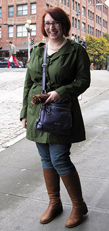
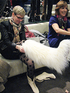 Next, at Nordstrom, I mentioned interest in the infamous peacock scarf, and received helpful input about which color would be the best complement to my mossy green trench coat. We spent a great deal of time combing the shoe and handbag departments, particularly browsing through the sea of beautiful boots. Julie tried on a couple pairs of sleek, faux-fur lined Aquatalia boots. After tracking down a pair of black studded Stuart Weitzman boots, Angie brought us to laughter by modeling some truly hilarious over the knee, white, furry Chanel boots. (Picture a white, shaggy, furry vest wrapped on top of a clear plastic pump.) After we calmed down a bit, we conceded that the mid-calf furry black pair was a bit more wearable! Angie and Anna very generously walked me through the purse department and gave me some great suggestions for where to start when buying a statement handbag, as this is quite a baffling bottleneck in my wardrobe.
In the accessories department, we took a look at the glass pearl necklace from the YLF store, where Angie gave Laurel, Anna, and me a follow-up lesson to her video blog post on knotting long necklaces. I couldn’t wait to try out this technique at home! We all explored which shades and bead shapes were the best complement to our styles and coloring. Before too long, it was time to say goodbye and go our separate ways.
As much as I had a blast shopping with such a fun and helpful group, my favorite part of the gathering was sharing so much laughter and information about our evolving personal style, learning new details about one another’s lifestyles, discussing our beloved children and pets. I was smiling all the way home just thinking about the uplifting day I had, and cannot wait to see all of you again (and also meet others who were unable to join us this time.) Thank you to Angie, Anna, Jenava, Julie, Antje, Shanette, Laurel, and Phoebe for making time to meet and for bringing such energy and enthusiasm to the afternoon – and thank you Angie and Greg for creating the opportunity to get to know such a fun and fabulous group!
