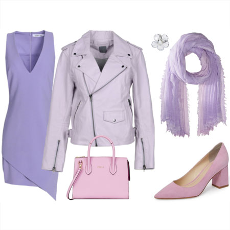
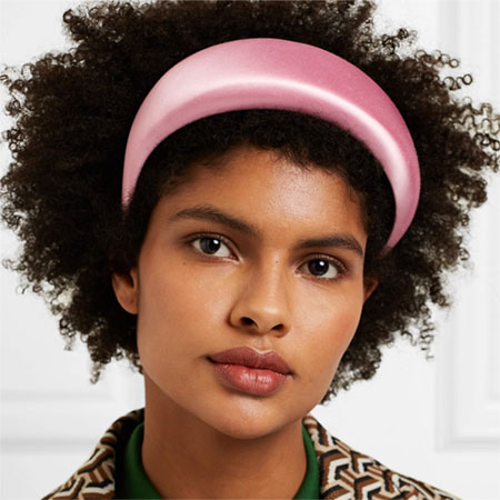
We see pastels in fashion every Spring and Summer. As per my trends post, celery green, pistachio, buttery yellow, pale pink, and light blue are the pastels of the moment. Combining light blue with buttery pale yellow, white, and earthy browns is particularly on trend. Of course, feel free to wear pastels like lilac, peach, and mint green if those are more to your liking.
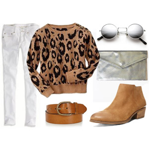
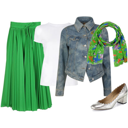
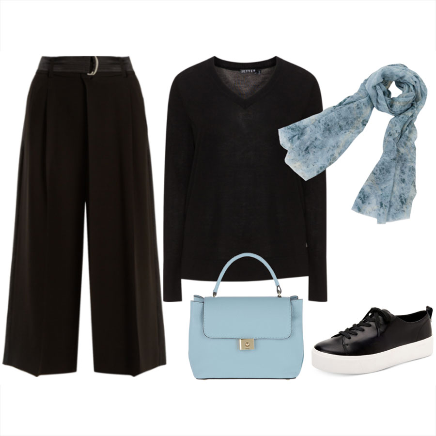
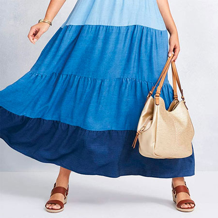
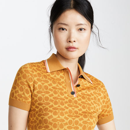
Pastels can look fresh, light, airy, romantic, calming, and pretty, especially after lots of wintery darks and heavy clothing. Pastels instantly soften an outfit, add a charming and graceful quality, and are an entry point to wearing a particular colour. They are less of a commitment than wearing brights, thereby adding interest without the intensity. Pastels are an effective component of tonal dressing, where soft hues are remixed with darker ones to create a cohesive palette. Pastels add playful tension when remixed with dark colours. They also pair well with neutrals like white, cream, tan, navy, toffee, whiskey, chocolate, grey, and blue denim.
On the other hand, because pastels lack depth they can wash you out and drain your complexion. The visual effect feels flat rather than fresh. Pastels can look overly sweet, faded, or child-like. If you like wearing bold, high-energy outfits, pastels may feel too subdued. They also don’t have the punch of brights or the drama of darks.
Here are styling tips to make pastels work, should you want to wear them:
- Add high contrast to the outfit with navy, charcoal, chocolate, or black. Or wear them with brights.
- Combine pastels with crisp white for a clean and modern vibe.
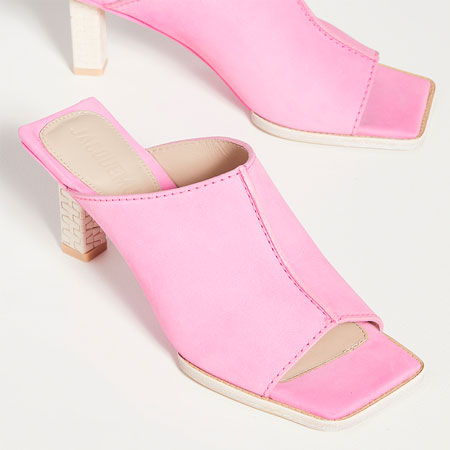
- Choose saturated pastels over more watery and dusty ones if you need more brightness.
- Wear pastels on your bottom half if they wash you out near your face.
- Wear pastels in structured and tailored items to offset softness and to look more “grown-up”.
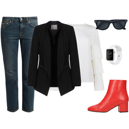
6. Anchor pastel pieces with a hard-edged or “tough” element like leather, hardware, chunky footwear, and dark colours.
I’m a bright colour person at heart, and thoroughly enjoy pretty pastels. My pastels of choice are pale pink and light blue. I don’t wear other pastels. My favourite eyewear of all time is a saturated light blue, and I have pale pink specs that I frequently wear too. I adore very light wash blue jeans, pale pink clothes, and light blue shirts. I find light blue and pale pink bags useful styling tools because they add an unexpected element. I used to have pastel shoes to match the bags, and miss them. They’re on my shopping list. The pastel pink scarf is a great match with my pink eyewear. Here’s my current collection of pastels.


As for styling pastels, I follow the first five of my own suggestions. A saturated pastel works best of all. I wear pastels with brights, navy, and crisp white or cream to create contrast. I wear them as accessories and shoes too. If the right light blue and pale pink wool coats find me at some point, I’ll welcome them to my outerwear capsule.
Over to you. Do you wear pastels, and if so, which are your favourites? How do you style them?