It’s been many months in the making and it’s finally here. If you can read this post, Greg is breathing a HUGE sigh of relief. He tells me that in addition to the obvious new features, there were a lot of changes “under the hood”. But I don’t understand that stuff, and you don’t need to know about it, so on to the interesting goodies. I’ll talk about things in relation to the three big goals Greg talked about earlier this week: (1) simplifying the way people, especially new people, navigate the site, (2) richer ways of presenting the visuals and (3) taming the forum.
Features
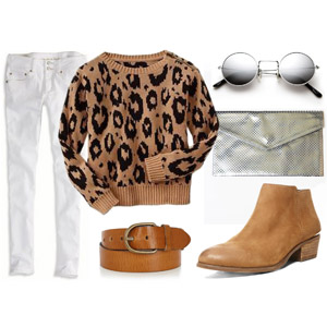
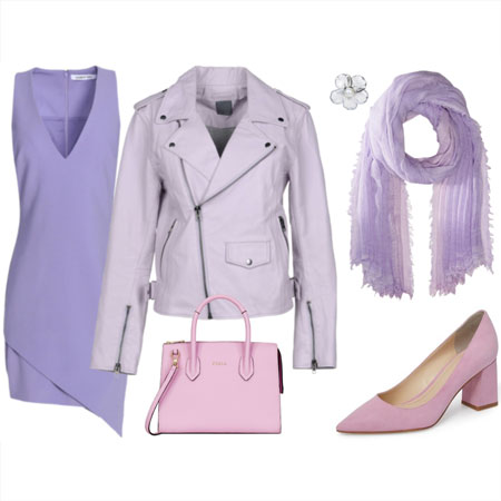
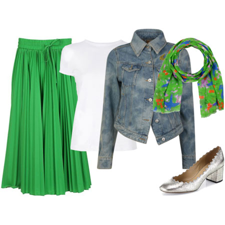
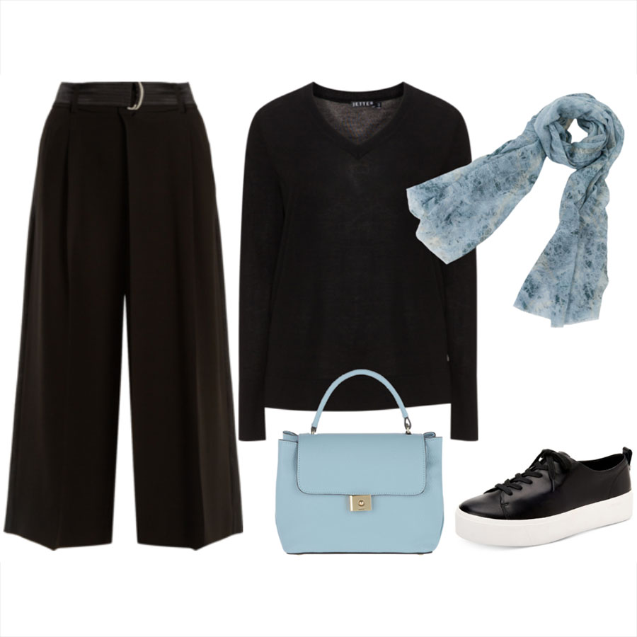
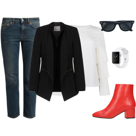
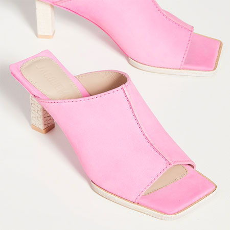
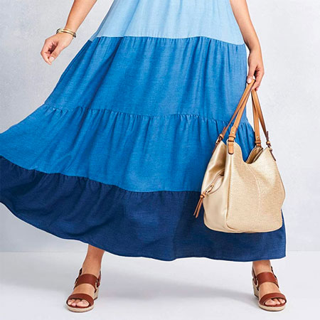
YLF is about what to wear, how to wear it, and having fun with fashion. Our goal with the new front page is to make this very obvious to new visitors, and to give new and regular visitors easier access to the most popular content. So in addition to a more friendly layout, the front page now also has four “channels”: Outfits, Ensembles, Trends and Advice. The latest feature post on each of these topics will always be showcased on the front page, and the channel pages will collect those big feature layouts so you can browse them later when they drop off the front page to make place for the next feature.
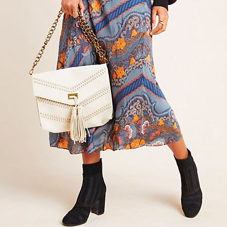
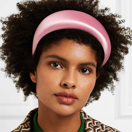
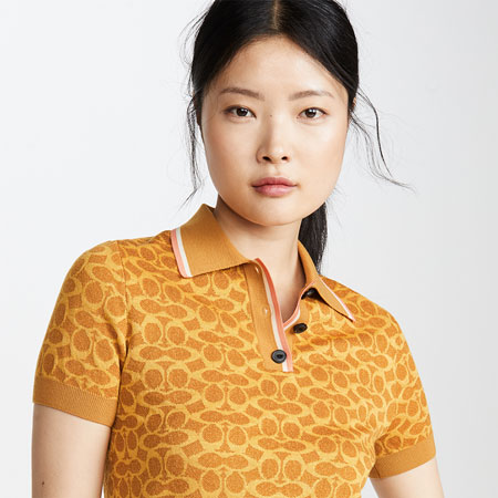
Aside from the simplicity of the big features on the front page, we like them because they give us a chance to showcase the visuals. And whether it is collecting product pictures to explain new trends, creating ensembles in Polyvore, or taking outfit photographs, we put a lot of effort into the visuals on YLF.
Layouts
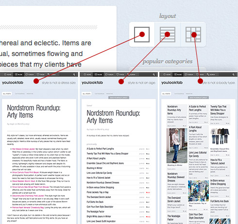
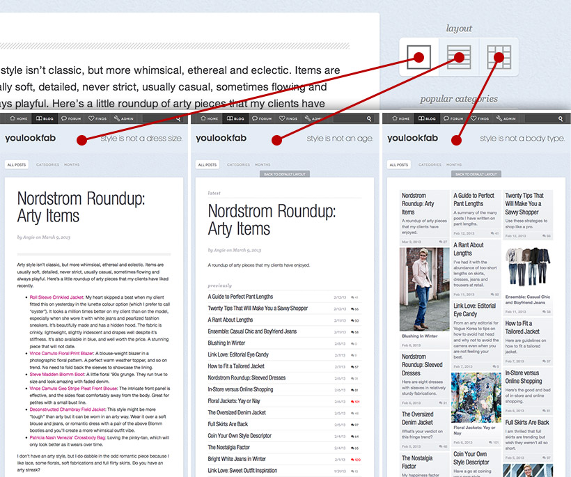
Another feature that both simplifies the navigation and showcases the visuals is “Layouts”. In any place that has a list of posts you will be able to view those lists in multiple ways. First, there is the traditional “posts” view that you see on most blogs. A sequence of posts in reverse chronological order. Second is the “list” view, which is particularly useful in the archives and in the forum. Third, and most exciting, is the “masonry” view. The old YLF used a masonry layout on the front page for recent forum posts, but it is Pinterest that has made this layout so popular. Now you can use it almost everywhere in YLF.
YLF allows you to change the layouts independently for different categories in the blog and forum. And we have tried to select useful default layouts. For example, the blog front page looks like a normal blog by default and blog categories use list layouts by default. Except for the Angie’s Outfits and Client Outfits categories, which are masonry layouts by default. If you make changes to layouts YLF will remember them for a little while, but if you return the next day they will be back to their default state.
Modes
I wanted to call this feature the Accordion, but Greg made it so he got to name it. It is very simple — if your browser is wide open we’ll make use of the space to show a wider site, and if your window is narrow then the content will shuffle around to fit in the smaller space. Sometimes pictures will get smaller, and in some rare cases some less important information will disappear in the narrow mode. You will see the narrow mode when you hold your iPad in the portrait orientation, and the wider mode when you hold it in landscape.
Currently there are only these two modes, but Greg is working on a third one that will make the site much easier to use on phones.
One thing to note is that if you use Internet Explorer you need at least version 9 to see the different modes. Older versions only see the wide mode.
Watching
The forum seems to move faster every day and it is getting harder and harder to keep up. We have noticed this, but it has also been discussed on the forum and in private feedback that people have sent to us. We have brainstormed many ideas for dealing with this happy problem, and “Watching” is the first step.
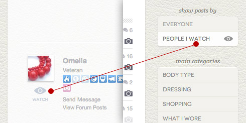
Here’s how it works: you can “watch” people by clicking the “Watch” icon under their profile picture. Once you do this you will see a new option on the forum sidebar that lets you choose either “Everyone” or “People I Watch”. If you select the latter then it is like you have your own customized subset of the forum. You will still see other members in the replies, but you will only see conversations, or threads, that are started by the people you watch.
If you go to someone’s profile page you will see there is also an option to block someone. If you do, then you won’t see the conversations they start at all, and you won’t receive the private messages that they send to you. You will see their replies in conversations started by other people though.
I have mentioned four big features, but I’m sure you’ll notice many other changes in the new design. One old thing with a new name is “Finds”. Previously we called this the store, but it really is a curated list of things we love and it links to actual stores where you can buy the items. So “Finds” does a better job of capturing what we’re doing.
Phew! Lots of new things to digest. Although it looks quite different, we hope that YLF still feels like home. It might take a while to get used to the new design and layout options, but as you use the new site you’ll find that a lot is still the same. And of course, Greg, Inge and I are still the same!
Enjoy the new YLF. I think it’s the best version yet.
PS. There are bound to be teething problems in the next couple of days, so do bear with us as we sort them out. If you are a member you can use the new “Help & Support” category to report bugs or ask questions. If you aren’t a member, please feel free to contact us using the forum or on Twitter.
