Has anyone noticed Gap’s new logo? I must admit that I hadn’t until Greg brought it to my attention. The new logo was launched on Gap.com about a week ago. The typeface is Helvetica, which many designers regard to be over used, and there is an awkwardly placed blue square behind the end of the word. Now compare that to the outstanding branded logo we’ve identified with Gap for over 20 years – crisp white writing within a clean blue square. There’s no comparison.
I perceive the Gap as the quintessential American Store and identified strongly with their old branding. It is distinctive and simple. The blue and white combination was wholesome, clean-cut and denim friendly. In a sense, timeless. Very “Gap”.
At the same time, I realize that I can be resistant to change. Is that what this is all about? Is the passionate and widespread disapproval of the new logo just the result of us all being so attached to the old logo that we can’t accept a new one?
As a result of the new logo’s negative reception, Gap’s management has said that they are open to input. They have asked the public to share their design ideas through a crowdsourced contest. Well, that move made the professional designers angry! If you want killer logo design, you have to pay professionals to get it – don’t ask the public to slap it together for free using PowerPoint. Oh heavens. What a mess.
I understand that the evolution of a logo is a necessary part of a retailers journey. But perhaps Gap’s logo change should have been more subtle because, like me, many people become attached to branding that has become an institution. What do you think of Gap’s new logo? Do you prefer the old one? Do you even care?
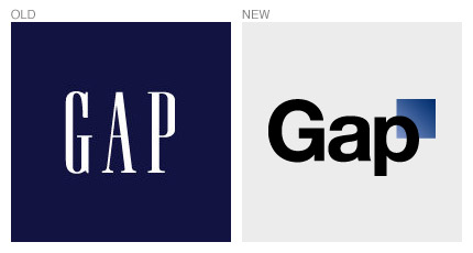
Update: As Ana pointed out in her comment below, Gap has apparently reverted to their original logo.
