Refined Casual: Subtle Patterned Jeans

Here are seven skinny and straight leg jeans styles with subtle tonal patterns, which work well in refined casual outfits based on dark neutrals. Keep the tops and toppers tonal in shades of grey, blue and black, or throw in some white to brighten up the look. 

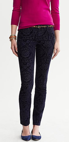
  • Banana Republic Flocked Skinny Jeans: These run true to size and fit pretty well. The fabric is thick, structured, and not too stretchy. They would be mine if they weren’t ankle length, although I might reconsider and wear them tucked into tall boots. 
  • Two by Vince Camuto Jacquard Skinny Jeans: Super, super soft and don’t feel like denim on the body. Much less rigid than the Banana Republic jeans, and a lot cozier too. The rise is quite high, and there is plenty of stretch in the waistband. Runs true to size, and full length. Personally, I prefer a stiff and rigid fit in jeans, but many of my clients like the soft and cozy comfort of this type of pant. They resemble denim from afar, but feel like pajamas. 
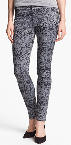
  • Two by Vince Camuto Coated Print Skinny Jeans: I was surprised that the waxed finish on these jeans was NOT hard and rubbery. In fact, they are soft. Fitted through the leg but roomy on the waist and tummy area — although the photo does not suggest that fit. These are one alternative to camouflage print. 
  • Gap 1969 Always Floral Jeans: Fab if the cropped length is not an issue. Stiff and very little stretch. Love that. Read the rave reviews. 
  • Zara Flock Jeans: Super thick and cozy. The rises are very high, which put me off because I prefer low rise jeans. But it’s just what the doctor ordered for others, which might make it a great fit for you. Again, the length is cropped so consider yourself warned. Runs small. 
  • NYDJ Sheri Print Skinny Stretch Jeans: Girdling on the midriff and also more subtle than camo print. Nice full length. 
  • NYDJ Sheri Print Stretch Jeans (Plus): These are the most subtle pattern of the lot and a repeat style from last year. I have many happy clients in this style because the fit is less tight through the leg, the pattern versatile, and the length ankle-covering. Also available in regular and petite sizes

Slim cropped jeans are excellent candidates for tucking into tall and mid-calf boots because they don’t bunch at the ankle. A point to consider when bypassing ankle length jeans in Fall and Winter.

Banana Republic Flocked Skinny JeansTwo by Vince Camuto Jacquard Skinny Jeans

Affiliates
Links in this post generate commissions for YLF.
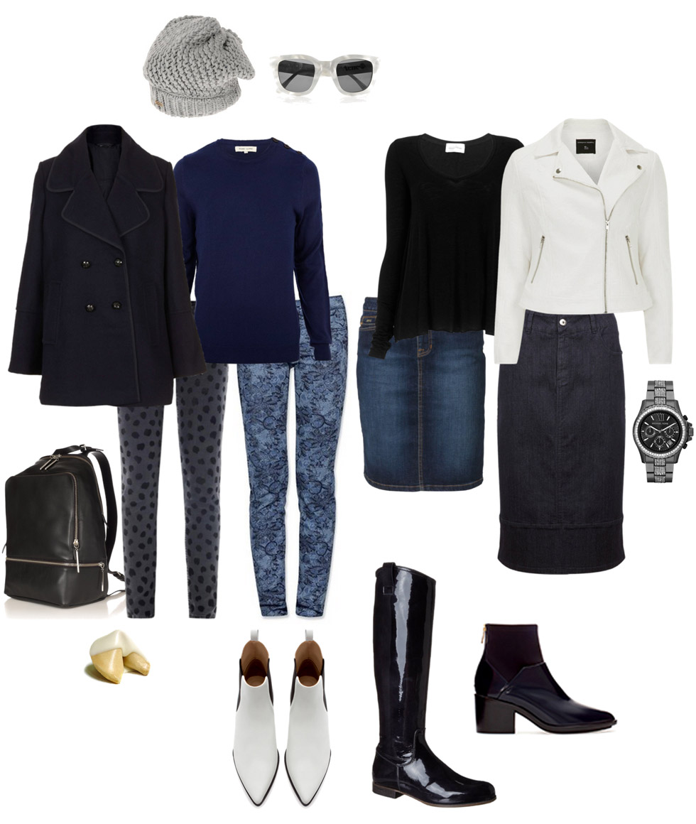
Midis with Movement for Spring 2014

Spring  2014 collections have hit the runways and I’ll be glued to my screen for the next five weeks watching every single show from New York, London, Milan and Paris. I pin the trending silhouettes, new colour combinations, and my favourite outfits along the way. This serves as inspiration for my own and my clients’ outfits for the upcoming season. I love watching the shows and breaking down what I see on the runways into bite-sized pieces. It brings me back to my fashion buying days, which I still miss from time to time. 

Although it’s early days because we’re only halfway through New York Fashion Week, it struck me that we might be heading into a skirt and dress season. And in particular, knee-covering skirts and dresses with movement. Many of the collections feature full skirts that are longer than minis. Variations on the trumpet skirt, which is fitted on the thigh but flares out with insets and godets further down the skirt, are especially strong. Circular skirts, pleated skirts and fit-and-flare dresses are also there.

Take a peek at some of my favourites, four days into the collections:

Derek Lam

Lela Rose

Tibi

Christian Siriano

Creatures of the Wind (a favourite show)

I’ll be extremely pleased if these are the mainstream skirt and dress trends for the seasons to follow. I love knee-covering skirts that swish and move as you stride. Full skater skirts were aplenty this year, but only in mini skirt lengths. It’s high time retail offered longer and fuller skirt options alongside modern classic pencil skirts. That way we’ll probably wear skirts and dresses more frequently, especially to the office.

I want a trumpet midi skirt right now. Who else is feeling the midis with movement trend for Spring 2014?

Ensemble: Refined Casual Darks for Mom on the Go

This casual outfit formula is based on dark colours like shades of navy, grey and black – a popular palette in cold weather. You don’t need to incorporate white, but I couldn’t resist showcasing it through footwear and topper just in case you love white as much as I do, and prefer to see a bright neutral in the mix. 

The refined integrity of the pieces is on trend. Sleek and simple silhouettes, clean lines, subtle textural interest, no distressing, no tough, minimal hardware and embellishment.

Here are the components: 

  • Bottoms: Choose grey, blue or black embossed or flocked jeans for a textural touch. Self-coloured patterned jeans are another option. Of course you can wear plain jeans, but you’ll lose the textural component that makes the outfit interesting. I added in some denim skirts if you fancy giving those a whirl with trendy footwear. 
  • Knitwear: Think solid fine gauge pullovers in black, grey or dark blue in a silhouette of your choice. V-neck, turtleneck, crew neck, scoop, high-low hemline. Anything at all. 
  • Topper: A dark peacoat is a modern classic, as is a moto jacket and military coat. A cocoon coat is another option. 
  • Footwear: Sleek black riding boots are modern classic, and patent gets my vote for Team Magpie. I’ve thrown in streamlined flat white Beatle booties and low heeled ink blue navy ankle boots as trendy options. Wear them with the jeans or skirt. No studs or zippers. 
  • Accessories: Finish off the outfit with an oh-so-trendy upscale backpack as a nod to the ’90s. If that doesn’t float your boat, choose a chic tote, crossbody or satchel. Throw in a casual wooly beenie, newsboy or beret if you like to wear hats. Add eyewear if you need specs or sunnies. Leave off the scarf and jewellery and sport outfit simplicity. 

 Refined Casual Darks for MOTG

The strength of the formula lies in the combination of pairing simple, tonal dark colours (adding white is optional). Apart from the denim, the pieces have a crisp and dressy integrity to them. This creates a more sophisticated casual outfit, especially when the fits are tailored and fluid.

Roundups

Simpler Items

This week's list of top picks list is about basic pieces.

Read More

Assorted Items

Items for Summer, both in and out of air conditioning.

Read More

Casual Summer Vibes

This week's top picks are good for a casual Summer vibe.

Read More

Summery Earth Tones

These items are for those who like to wear casual earth tones in warm and hot weather.

Read More

Hints of Spring

Some tried-and-tested winning items to refresh your style for Spring.

Read More

Dressier Items

An assortment of dressier top picks might be just what the doctor ordered.

Read More

Link Love: Woollies Then and Now

Designer Bella Freud, best known for her slogan knits like “Je t’aime Jane”, has created a whimsical country-inspired knitwear collection for the iconic British brand Barbour.

In her essay on knitting, Alison Lurie goes into the history of the craft and chats about how knitters are depicted in literature. I found it a very enjoyable read.

Adam Jones, Dior’s former knitwear designer, has just launched Yarnlight Collective, a collection of mood-enhancing knitwear. Journalist Stephanie Theobald puts one of his sweater’s to the test and shares her findings with us.

Fab Links from Our Members

Kkards was struck by how succinctly Suzy Menkes outlined the impact of globalization, online shopping and fast fashion retailers on the world of fashion in this NYTimes article.

Lyn* enjoyed Bonnie’s exploration of how she feels about her nose through a series of photographs snapped throughout the years.

This article over at The Cutting Glass on “Alternatives to the Standard Men’s Suit” got Vildy wondering how all those pioneer women and men, wrapped in layers of voluminous garments, ever got anything done.

Angie had fun browsing these Singapore street style shots, featuring lots of ladies dressing very stylishly despite the most hot and humid weather on earth.

Rholmes27 is very intrigued by this “Dream Specific Wardrobe Dreams” approach of finding wardrobe holes and making a shopping plan. 

Harmonica and Suz point us to this short Popsugar video that in a playful way shows us ten ways to wear a classic white button-down.

How to Wear Colours That Don’t Love You Back

We all have flattering colours that make us look fresh, healthy and vibrant by complementing the colours in our hair, eyes and skin tone. And then there are the colours that makes us look dull, overpowered, sickly or severe. 

Personal colour analysis by a professional (often an image consultant) is one way to pinpoint a set of colours that works well for us. Another is to work through a book like “Color Me Confident” by Veronique Henderson and Pat Henshaw. If you are battling to find colours that work and feel overwhelmed by all the options, then this will be an interesting process and a helpful starting point. It might help you to build a wardrobe around a few focused colour palettes and simplify the mix and matchability of your pieces. 

But what happens when you don’t like the colours that were suggested to you, while the colours that you love don’t make the list at all. Or when you like to reflect seasonal trends in your style but the fashionable colours aren’t on the list? Fashion is about fun, and where is the fun in excluding colours from your repertoire?

Colour relativity to the rescue!

We see colours in relation to each other and not as isolated variables. Colours “change” when they are surrounded by other colours. And I don’t mean we just think about them differently, I mean that we actually “see” something different. Greg brought up some interesting optical illusions when I mentioned that I was writing about colour being relative. It’s such an interesting phenomenon that I’m going to go on a little tangent.

Consider this picture.

Illusion 1

See the gradient in the inner rectangle, how it goes from light to dark? Well, there actually isn’t a gradient at all. That is actually one uniform colour. Your brain is telling you there is a gradient because of the surrounding colours, but it isn’t there.

Here’s another optical illusion where we get the colours wrong:

Illusion 2

See the two different shades of grey on the A and B squares? Another trick question, because those squares are exactly the same shade of grey. This is so hard to believe that you might be tempted to save that image onto your computer and check for yourself. Try it! Or click here to see the deconstruction of the illusion.

Greg tells me that all of the cells on our retina that “detect” colours are connected. So what one cell “sees” is directly affected by what the cells around it see. In addition to that the brain tries to compensate for lighting conditions and often makes mistakes (like the second illusion above) when doing so.

Now, I’m not at all suggesting that we should be wearing grey checks and gradients. These optical illusions really just illustrate how colour perception is way too complicated to be represented by a single set of good colours. The important thing is that imperfections in our perception of colour open up many possibilities.

Here are three simple strategies that use the relativity of colour to make it possible to wear colours that aren’t on your list.

Combine Them with Your Best Colours

Recently I mentioned that although grey is not one of my best colours, it springs to life and becomes flattering if I wear it with a sour shade of citron and bright white. It’s like waving a magic wand over the grey. Same goes for a muted blush pink that only works when I wear it with a crisp pastel pink, tomato red, or black and white. 

Wear Them in a Smaller Surface Area

One of my clients loves black, but it does not love her back. She feels that it is harsh and aging against her complexion. So she sticks to wearing black on smaller surface areas like handbags, belts and footwear, keeping navy and shades of grey as her dark neutrals for clothing. She’ll also wear black when it’s incorporated into a pattern with her best colours like French blue, purple and teal.

Similarly, I look awful in burgundy, but I will wear it in small surface areas when it’s incorporated into a pattern, like in the burgundy in this twinset.

Wear Them Away from Your Face

Wear colours that don’t look fab against your face on the bottom half of your body. One of my clients wouldn’t dream of wearing stone and dove grey as a top or topper because the shades wash her out and make her look sleepy. But she’ll happily wear them in a skirt, jeans, pair of trousers, or as footwear.

Think further than the confines of your prescribed colour palette. Your so-called “best” colours are merely a starting point. Like so much of the advice we hear about style, they should be seen as guidelines, not rules. You can wear pretty much any colour you care to if you wear it in the right way.