Meeting the Miz Mooz Team

Last month, while in NYC  for Fashion Week, Greg and I popped into the offices of Miz Mooz located on a bustling Broadway Avenue. If you aren’t familiar with this fabulous footwear brand, read about them in this recent product review. Our readership is as enamoured of their fun colours, retro styling and cushioning footbeds as I am.

The Miz Mooz showroom and head office is located behind one of their stores, which in itself is fabulous. Can’t get closer to your customer than that! So we walked through the store first in order to get to the showroom. There we were met by delightful employees, Cheryl Matson and Jeffrey Bart, who made us feel right at home. I couldn’t resist wearing my own red Miz Mooz Alcott pumps to the meeting. Needless to say they received a standing ovation.
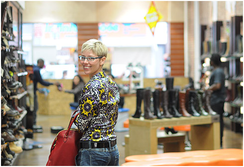
Miz Mooz runs an impressive and tight operation. You’d never guess that aside from retail staff, the entire company is seven people, and the oldest employee is 30. Quite the young and dynamic bunch.

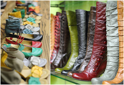
Cheryl and Jeffrey ran us through both their Fall and Spring collections and I was in my element. The experience took me back to my buying days as I handled all sorts of samples and prototypes. So fun! As I browsed the showroom racks, I couldn’t help but shout out: “Those are in the YLF store!”, and “Oh! I have the apple green Carlitos. I love them because they are hip and comfortable!”, and “I have a friend who bought those boots in both colours because she liked them so much!”  What can I say? I’m a fan.
I asked about the origin of the unusual name and chuckling followed. Well, it turns out that aside from having a nice ring to it, “Miz Mooz” is a play on the Hebrew word for foreplay: “Meez Muz”.

The name is not the only Israeli connection. Miz Mooz also draws from Israeli footwear brand “Gazith”. According to Cheryl, Gazith is more of a sister brand than the Israeli Miz Mooz brand. “Our shoes share the same inspiration as Gazith, but we alter the line significantly to make it more suited to our market, and add our own styles. The Israeli shoes are a bit more… extreme!”

When I traveled to Israel last year, I did notice their fearlessly fashion forward footwear. I guess it makes sense to tone things down to suit the American market.
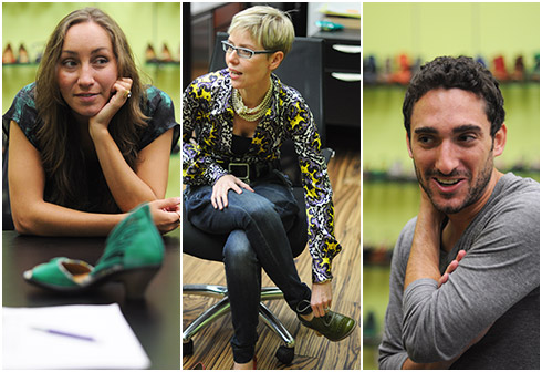
Cheryl explained that the unique distressed look of Miz Mooz footwear is created in a finishing process. “Whereas most shoes just work their way through the production line and are then placed in the boxes and shipped to customers, we have a team at the end of the line that polishes or distresses the product to the desired look, be it an extreme distressing with sandpaper or just a light burnishing with polishes. Each pair gets its own unique look through this process. It is a traditional way of making shoes — more hands on and less automated. We feel this process adds so much character to the product”. It does indeed.
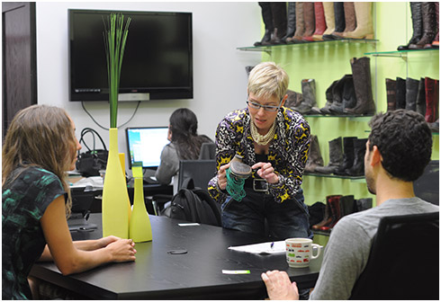
The most interesting piece of information that Cheryl shared with us: black is their worst selling colour. “People don’t want to buy black footwear from us”. It makes sense. Why purchase black Miz Mooz shoes when you can choose from an abundance of happy colours. On that note, the next pair of Miz Mooz shoes on my shopping list are the Ansel oxfords in green or the Histeric oxfords in chestnut.

Another nugget to bear in mind with gift giving season around the corner: Miz Mooz recently launched a small menswear collection.
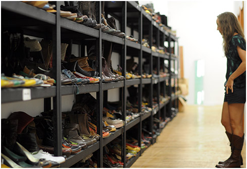
Our last stop before leaving was a wall of previous ranges. It was a great illustration of all that this little company has achieved in a short space of time. We look forward to many more winners from Miz Mooz.

Gap’s New Logo, or is it?

Has anyone noticed Gap’s new logo? I must admit that I hadn’t until Greg brought it to my attention. The new logo was launched on Gap.com about a week ago. The typeface is Helvetica, which many designers regard to be over used, and there is an awkwardly placed blue square behind the end of the word. Now compare that to the outstanding branded logo we’ve identified with Gap for over 20 years – crisp white writing within a clean blue square. There’s no comparison.

I perceive the Gap as the quintessential American Store and identified strongly with their old branding. It is distinctive and simple. The blue and white combination was wholesome, clean-cut and denim friendly. In a sense, timeless. Very “Gap”.

At the same time, I realize that I can be resistant to change. Is that what this is all about? Is the passionate and widespread disapproval of the new logo just the result of us all being so attached to the old logo that we can’t accept a new one?

As a result of the new logo’s negative reception, Gap’s management has said that they are open to input. They have asked the public to share their design ideas through a crowdsourced contest. Well, that move made the professional designers angry! If you want killer logo design, you have to pay professionals to get it – don’t ask the public to slap it together for free using PowerPoint. Oh heavens. What a mess.

I understand that the evolution of a logo is a necessary part of a retailers journey. But perhaps Gap’s logo change should have been more subtle because, like me, many people become attached to branding that has become an institution. What do you think of Gap’s new logo? Do you prefer the old one? Do you even care?

Update: As Ana pointed out in her comment below, Gap has apparently reverted to their original logo.

Leggings as Pants: Yay or Nay

A year ago my answer to this question would have been absolutely NAY, NAY, NAY! But today I’m a lot less emphatic. I still can’t vote yay, but I’m going with a much more gentle nay. And here’s why.

A few seasons ago, most legging styles resembled opaque hosiery at best. Cotton lycra knit legging styles were more substantial but the overall appearance of leggings was more like tights than pants. For this reason it seemed inappropriate to wear leggings as pants since you might as well have been walking around in your underwear.

Over the years, leggings styles have evolved and some are designed to look more like pants than hosiery. Like pull on Ponte knit pants, motocross leggings and legging jeans. They are thicker and offer plenty of coverage, much like a pair of skinny jeans. These types of leggings can be worn as pants.

So I guess the line has become more blurred. Some leggings styles are fine to be worn as pants whereas others function more like hose. It all boils down to the details and your definition of leggings.

I’m sticking to a more modest vote of “generally nay”, because there are too many tricky caveats associated with a general yay. What about you?


Roundups

Simpler Items

This week's list of top picks list is about basic pieces.

Read More

Assorted Items

Items for Summer, both in and out of air conditioning.

Read More

Casual Summer Vibes

This week's top picks are good for a casual Summer vibe.

Read More

Summery Earth Tones

These items are for those who like to wear casual earth tones in warm and hot weather.

Read More

Hints of Spring

Some tried-and-tested winning items to refresh your style for Spring.

Read More

Dressier Items

An assortment of dressier top picks might be just what the doctor ordered.

Read More

Shopping with Maria from Colour Me Happy

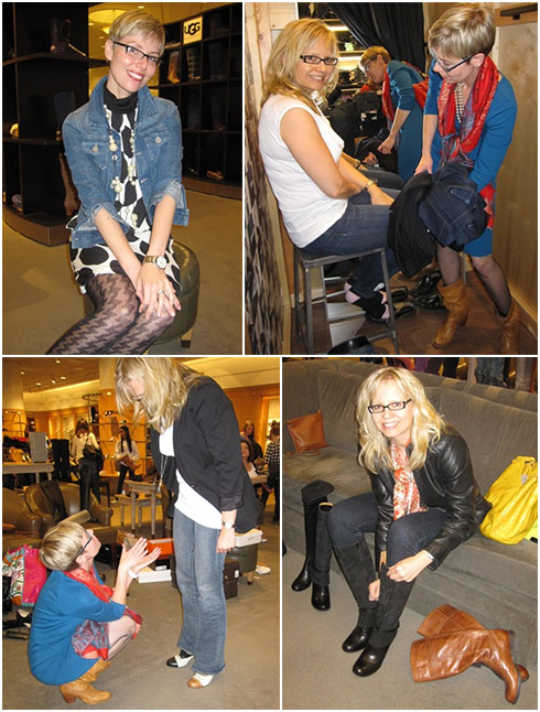
Remember fabulous Maria from Colour Me Happy? I arranged to meet her in Vancouver earlier this year after she wrote a very complimentary article about YLF (I happened to be in that neck of the woods for a wedding). We got on like a house on fire and it wasn’t long before Maria booked Autumn shopping time with me in Seattle. I was truly flattered and delighted to be hired by a very capable Designer and Colour Expert.

Maria and I spent a glorious two and a half days shopping together last week and it was an absolute pleasure from start to finish. We were very focused on the task at hand, but also laughed so much our cheeks were sore. Maria wrote about our shopping experience and of course, her words speak louder than mine.

And after you’ve read Maria’s post, subscribing to her blog and newsletter are a must if you haven’t done so already. Maria is full of tangible interior decorating advice and colour knowledge that will fill you up with happiness every time you walk through the door.

Thanks, Maria! I can’t wait to shop with you again.

Check out Maria’s post for more in action photo shots.

Andrew Walker on SJP and the Rule of Thirds

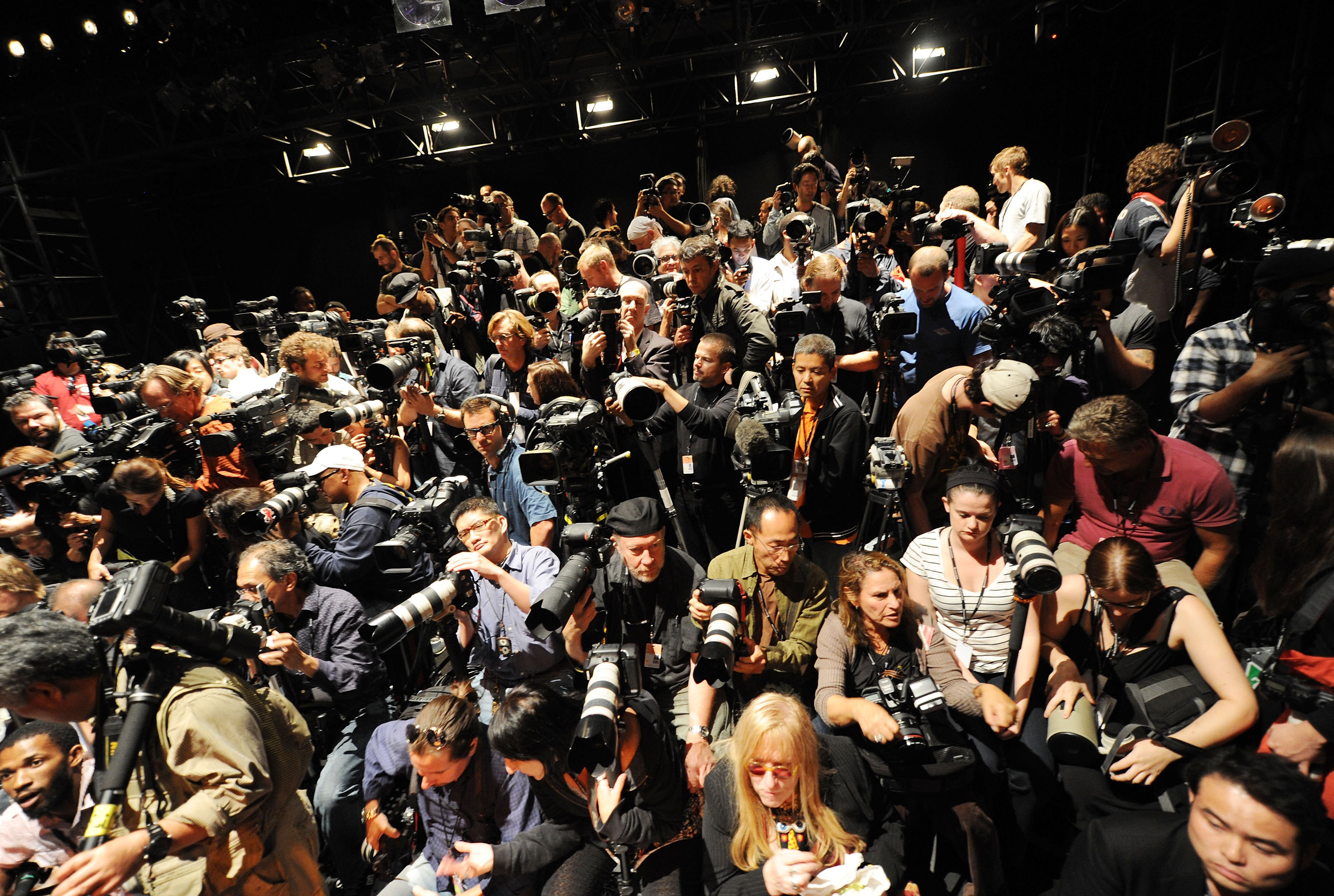
One of the things I took away from Mercedes Benz Fashion Week in February was an enormous respect for professional fashion photographers. Whether it’s the official ramp photographers on the media riser or the paparazzi outside the tents, the job is not easy. Lots of waiting, lugging around heavy equipment, jostling for position and, despite all the craziness, getting fantastic shots. So I was excited when Getty Images, house photographer for Spring/Summer Fashion Week, contacted us about interviewing one of their photographers.

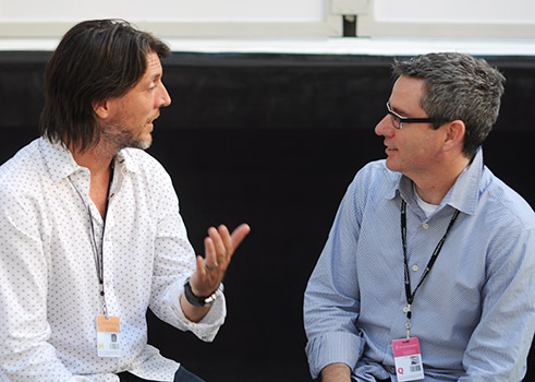
Andrew Walker has been photographing celebrities for a decade now and also does fashion photography, having covered the runway, parties and backstage action at Fashion Week for the last 5 years. This year he was the official photographer for IMG, the event organizers, and was tasked with capturing every aspect of the week. We sat down for a while between shows.

Andrew fell in love with photography while he was at school and although his degree was in Writing, he took every photography course they had on offer. After school, though, he moved away from photography. He was an art director in New York when 911 happened and soon after was laid off from his job. He decided that this was the opportunity to go back to his calling. He has friends in the music industry so a lot of his initial work was with bands, both cover art and live concerts, and this is still his favorite subject matter. Through the band photography and doing portraits for actor friends he built an impressive portfolio that got him where he is today.

He is best known for his incredible portraiture, so I was interested to know how he made his subjects comfortable in front of the camera. He explained using the example of some corporate portraits he did for a law firm. He likes to chat to the subject during the shoot about something other than the photos, “I put the camera down. ‘Did you see the game last night?’ Blah blah blah. Click!”. And he says it sometimes just takes time: “Almost always, after 5 or 10 minutes, people realize, ‘this is ok’. So by the end of the session they are comfortable”.

Talking to Andrew it’s also obvious how his friendly, laid back personality puts his subjects at ease. Modestly, he puts it this way: “I’m not as intense as a lot of the other photographers I know”.

Of course, I had to ask about equipment. His favorite piece of gear is his Nikon D3S camera body, which he says is the best camera he’s ever used because of its sensor and ability to shoot in low light. He likes fixed focal length lenses “for playing around”, but for the professional work he absolutely has to have the flexibility of a zoom. He has 14-24mm, 24-70mm and 70-200mm lenses with him at Fashion Week to cover all the bases.

He uses an iMac for his post processing and is still surprised at how much time he spends in front of a computer. But that’s one of the consequences of going digital and being able to take hundreds or even thousands of pictures in a day. He described trying to capture the atmosphere as photographers swarmed around Sarah Jessica Parker. “I had a slow shutter speed, really just trying to catch someone else’s flash on her face. I took 50 pictures right there, and I deleted 48 of them”.

We talked about the way that blogging is blurring the line between pro and amateur photography at Fashion Week. In amongst the serious photographers with serious equipment on the media riser, you frequently see a blogger standing with a point and shoot. I once even saw someone with a cellphone taking pictures from the riser. Andrew says the pros sometimes find this irritating, but they know that the quality difference is so big that the “cream will rise to the top”.

Andrew’s single most important piece of advice to amateur photographers? Use the rule of thirds for composition. This is explained quite nicely on Wikipedia — imagine your frame divided up into 9 equal areas and put the focal point of the picture in one of the places where the lines that divide these areas intersect.

Thank you Andrew for taking the time to chat with us. It was a thrill to sit down in the midst of Fashion Week and hear the perspectives of a great professional photographer.

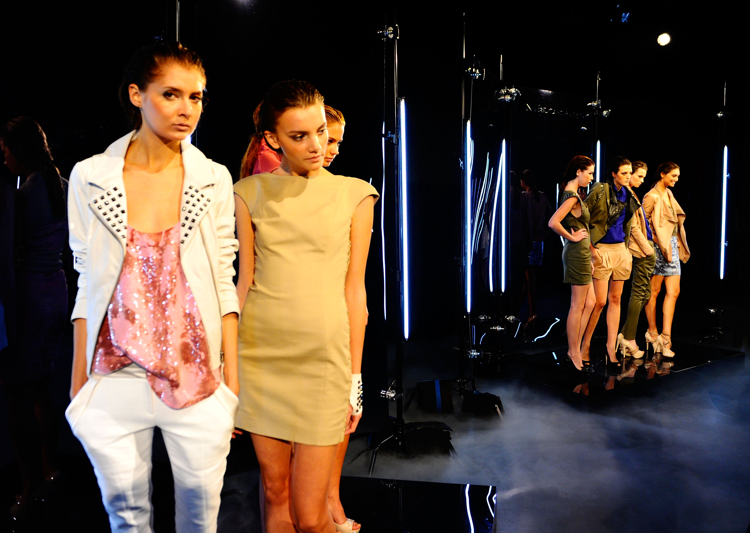
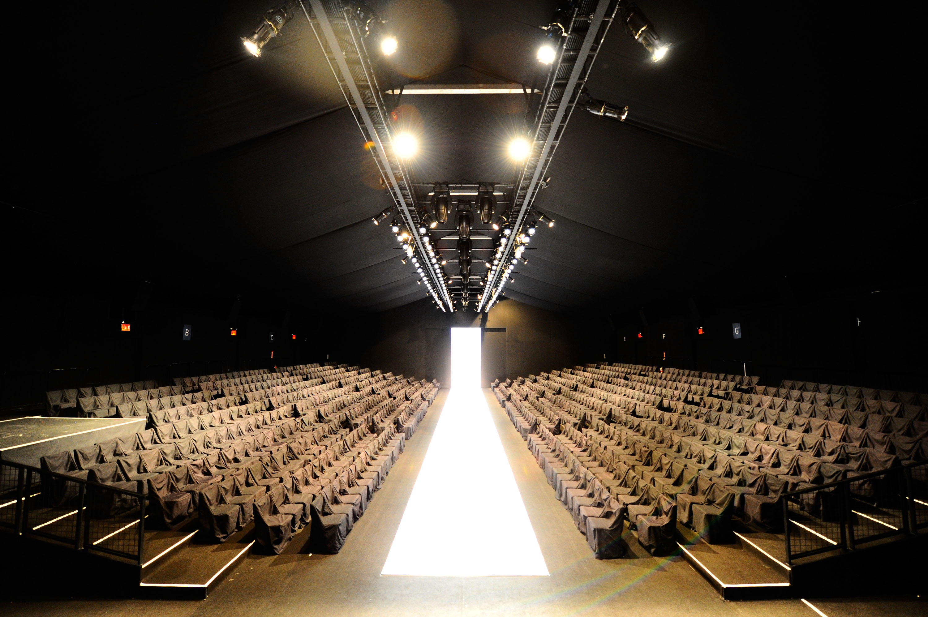
Getty was kind enough to give us a few of Andrew’s photos for this post (including the one I used for the background). Be sure to click the individual pictures to see a larger version — they really deserve some extra real estate on your screen.

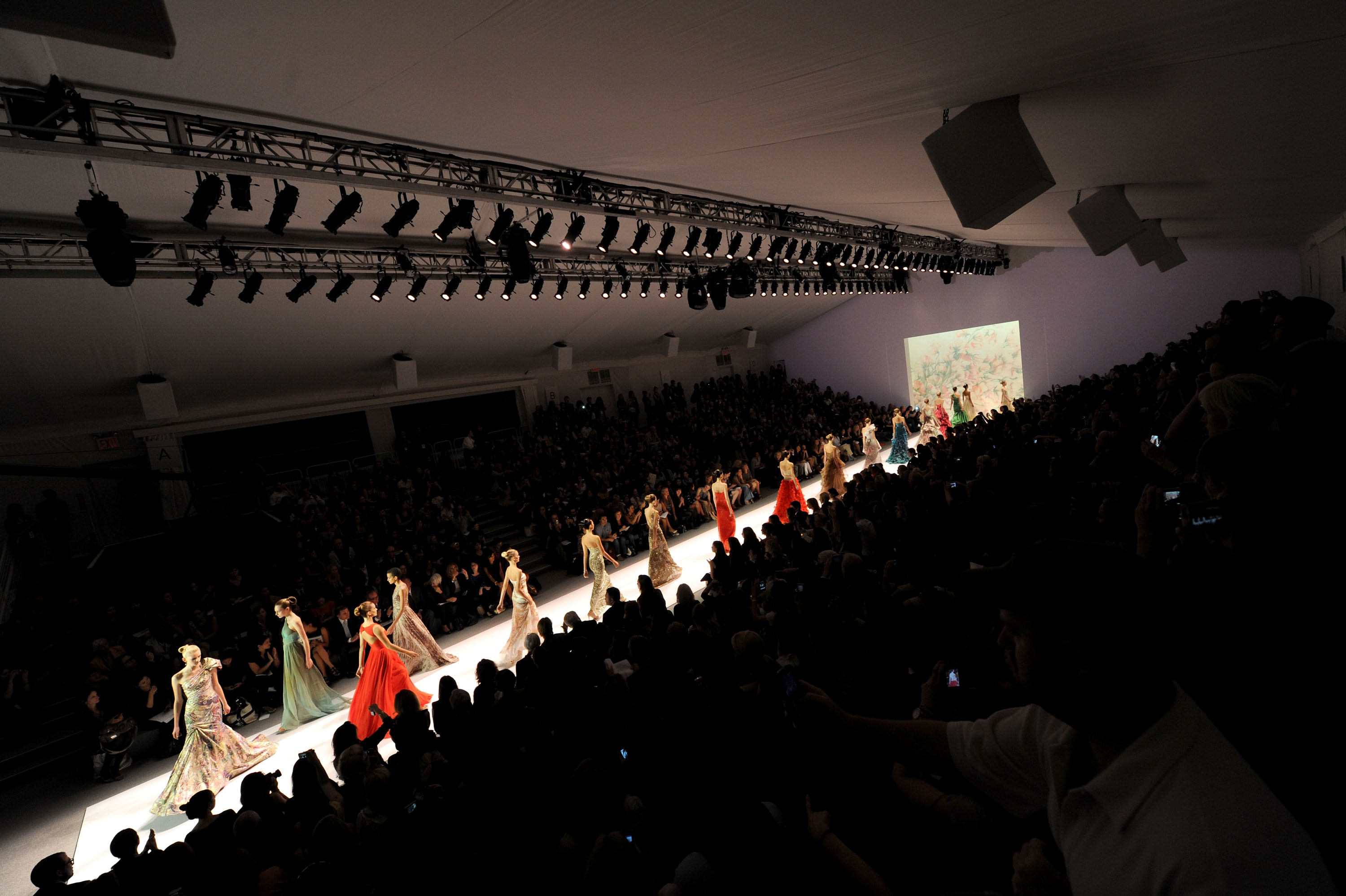
This one illustrates the rule of thirds quite nicely, and I love that the focal point is the group of models that are further away.

We have only seen this venue when it was packed full of people, so this is a great perspective. The calm before the storm.

I am far too hung up on keeping the horizon horizontal. The angle of this photo and the lens distortion makes the movement come to life.

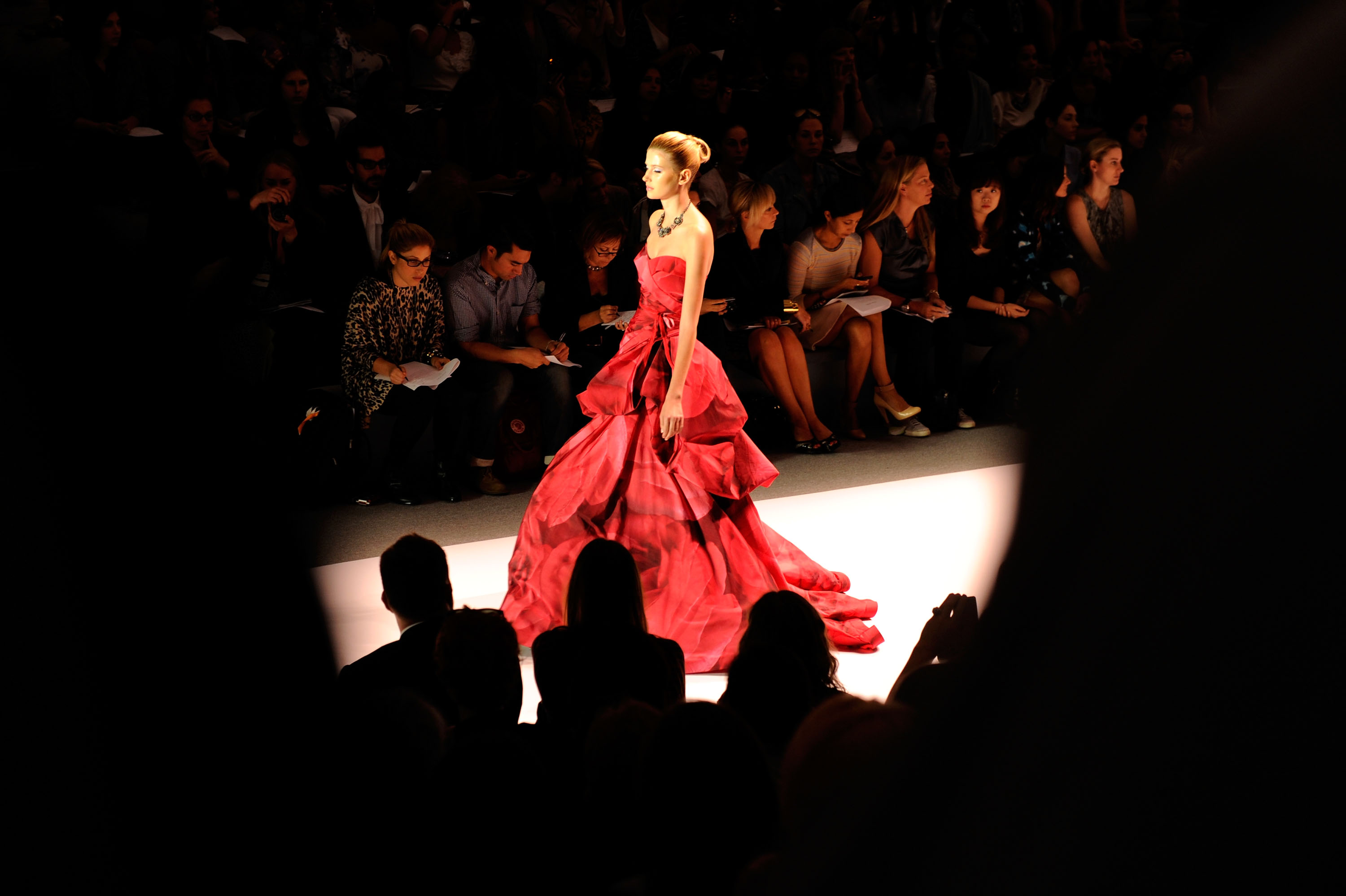
This is often the view from our vantage point at the shows, turned to an advantage here as Andrew uses the audience to frame the model.

Again the angle somehow creates movement, and the runway on the diagonal makes such a visual impact.

Visit Andrew’s online portfolio to see more great photography.