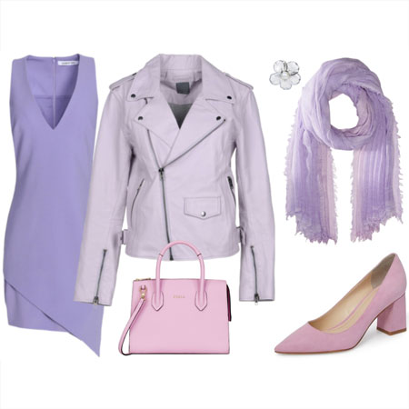
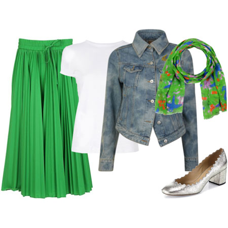
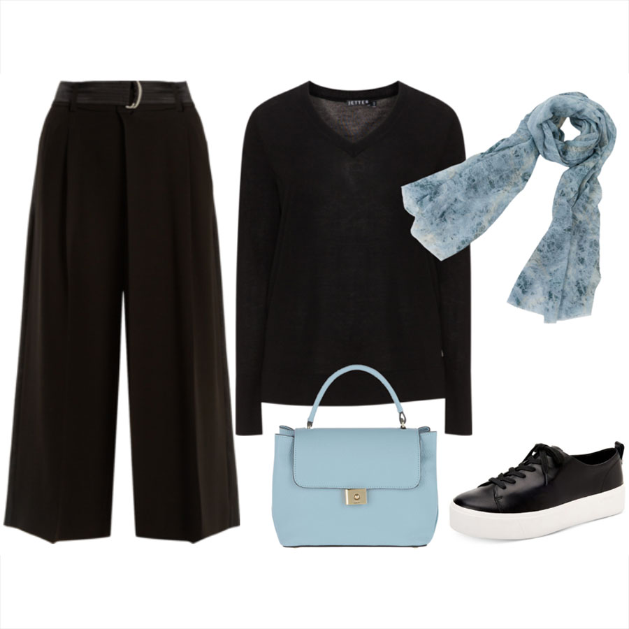
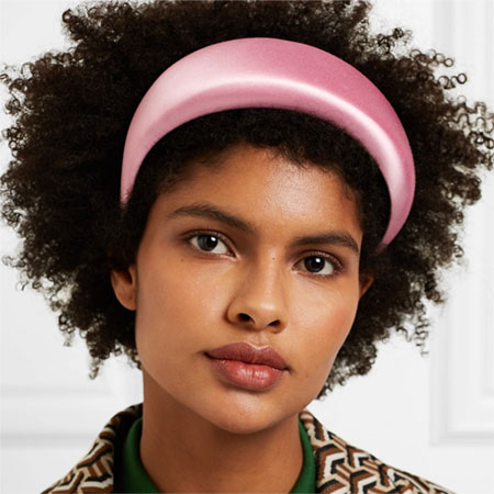
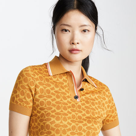
Today we’re choosing between your favourite types of non-neutrals. Pastels have a lot of white in them. They are light, soft, muted, and have low visual intensity. They can feel delicate, pretty, and romantic. Mid-tones sit in the middle of the light-to-dark colour spectrum. They aren’t very pale and they aren’t very dark. They can be muted or vivid, and visually versatile, calming, interesting and balanced. Brights are high-saturation colours that are vivid and intense. They are visually strong, impactful, playful and energetic. Darks are rich and deep. They can be grounding, romantic, serious, elegant and dramatic.
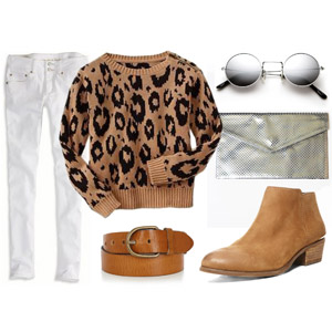
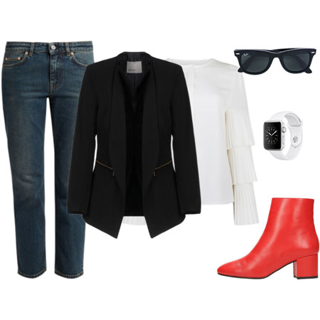
I wear pastels like light pink and light blue. I have eyewear in both, which I love and wear daily. I also love light blue denim. I don’t wear many mid-tones or dark colours. I wear sour brights, and have a very large assortment of them across all wardrobe items. When it comes to non-neutrals, I bat for Team Brights. I feel calm, happy, honest, and energized when I wear citron, lime, chartreuse, shocking pink, tomato red, Dutch orange, and bright turquoise. I remix different brights in one outfit and find them very versatile. They work well with my core neutrals, which are all sorts of whites, tans, navy, and toffee.
Over to you. Do you bat for Team Pastels, Mid-Tones, Brights, or Darks? Tell us why, and no batting for more than one team. If you can’t pick a side, you’re Team Bench. I’m serving Asian eggplant in peanut sauce, sticky white rice, pickled Perison cucumbers, and kale salad. I’ve run out of time, so please bring dessert.