This is a Sponsored Post written by me on behalf of Melrose Street. All opinions are 100% mine.
I recently had the opportunity to review a few products from Melrose Street, a sweet little online boutique that sells affordable casual chic dresses. By affordable I mean that most of the dresses cost between $30 and $49, and half that if you catch the goods on sale. I’m a total frock gal so I was excited to review these products.
I must admit that my expectations were not high when I first looked at the Melrose online assortment. Most of the dresses are knitted and I’m one of those rare breeds who prefers woven frocks and tops. The styling seemed less sophisticated than what I usually gravitate towards. And I’m extremely discerning about quality, refusing to wear anything that does not pass my sticky quality control standards. So Melrose Street chose quite a tough reviewer.
Nevertheless, I tried to keep an open mind as I selected three dresses (two knitted and one woven) for my $100 gift voucher. The first impressions made by the online experience were good. The aesthetics are pretty, and it is easy to navigate. I couldn’t find a search box to type something like “striped dresses” and that would be a good addition. Even so, their assortment is small enough that it is quite easy to take it all in. This is a nice change from the normal overwhelming selection of the big retailers.
The dresses arrived in meticulously packaged bags a few days later. Here’s the scoop on each item in detail:
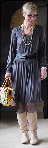
- Grey Lani long sleeved knit dress: I opened this package first and was blown away by the quality of the knit for the price. It’s substantial, drapes well and fits perfectly. Plus it’s super soft, very comfortable and in a rayon/spandex blend, so no clinging. This style is ideal with light coloured boots and a denim jacket for a Seattle Spring and that’s how I’m wearing it now. It’s my favourite item of the three.
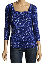
- Striped Solemio Sleeveless Striped knit dress (sold out online): Again, at the price I was pleasantly surprised by how well the garment was made. The fabric is a weighty polyester/rayon blend and the seaming is faultless. The style was too short to sport as a dress, but I knew that going into the purchase. I thought it would make a fun casual tunic top for jeans and clamdiggers, so that’s how I’m wearing it. This style has an alluring low back and roomy underarm openings that I rather fancy, just because it’s different.
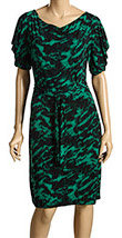
- Purple Trinity sleeveless woven dress: I adore voluminous items and was immediately attracted to this silhouette and colour. It’s in a bubble style and in my favourite warm weather fabric, a silk/cotton blend, which made me like it even more. Unfortunately, it’s a little too roomy all over and I can’t size down. It’s also too short to wear as a dress even though I’m only regular height. But by layering it over another dress and adding a belt, I managed to rein in the excess volume and secure a bit of coverage.
Most of the styles from Melrose Street are machine washable. Some of the styles are hand wash only, but you might get away with popping them into the machine on the “delicates” setting (that’s what I do).
Based on this experience I would say that the merchandise runs true to size. The design details are more interesting than what is often offered at this price point, and the items met my quality standard. If I had to make comparisons, I’d say that the items I received were higher quality than I would expect to find at H&M. The styles might not be to your liking at first glance, but as with most dresses, you need to try them on before you make that final judgment call.
All in all, I came away from my Melrose Street experience very impressed with all aspects of the operation, and happy with my new acquisitions. And you can try them too! We are giving away one $50 gift certificate to someone who makes a comment below. Tell us which of these three dresses you like best, and also what you think of the Melrose Street range in general. We will choose the winner using a random number generator, and the contest closes at 5pm (Pacific Standard Time) on April 23.


I selected these three dresses. Right now the one in the center is sold out.


