Phase 2 of the YLF Redesign: The Phone

In mid March we launched the YLF redesign. One of the features we highlighted then was what we call “Modes”, which lays out the site differently when the browser window is different sizes. The modes are also aware of the iPad, putting the site in narrow mode when the iPad is held in portrait orientation and in wide mode when it’s in landscape orientation.

Angie explained in her launch post that we were also working on a 3rd mode that would make the site easy to use on the smaller screen of a smartphone like the iPhone, Windows Phone or one of the many Android phones. As of a few minutes ago, this 3rd mode is now enabled, and if you browse to YLF on your phone you should see the new layout.

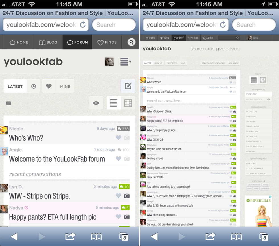
If you don’t have your phone handy, here is the difference you will see on the forum front page. The new phone mode is on the left.

Forum Before & After

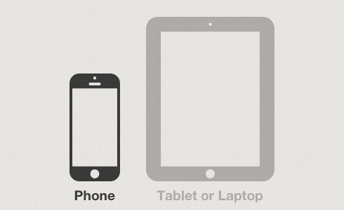
If you would prefer YLF on your phone to look exactly like it would on a computer or the iPad, then scroll to the bottom of any page and click on the tablet icon (that’s the one on the right below). You can also switch back to phone mode by clicking the phone icon on the left. YLF will remember your selection for about one month at a time.

Selector

There are many little differences between the phone mode and the original narrow and wide modes. In some cases things that were in the sidebar on the right are now in the main column. In other cases some non-essential information is left out. It has a different photo viewer that is more suited to a small screen. Phone mode is also a little more like an app in that you can’t zoom in and out.

We have tested the new phone mode quite a lot, but there are many, many phones that we have never even used. So please let us know if you come across any issues. Also, let us know if anything is still hard to use. I’m sure we will need to make refinements.

Enjoy!

Now Open to Active Members: Create Your Own Blog

For the last few months we’ve been beta testing a new YLF feature: An easy-to-use blogging platform for our members to create their own outfit and style blogs. To date we have only had a small group of people testing the feature, but this week we’re opening it up to all YLF members at the “active member” level.

The concept is very simple. As easily as our members can post something to the YLF forum, they can post it to their blog. And getting started with a new blog is a single click affair. One of our goals is to make outfit blogging easier than it has ever been before.

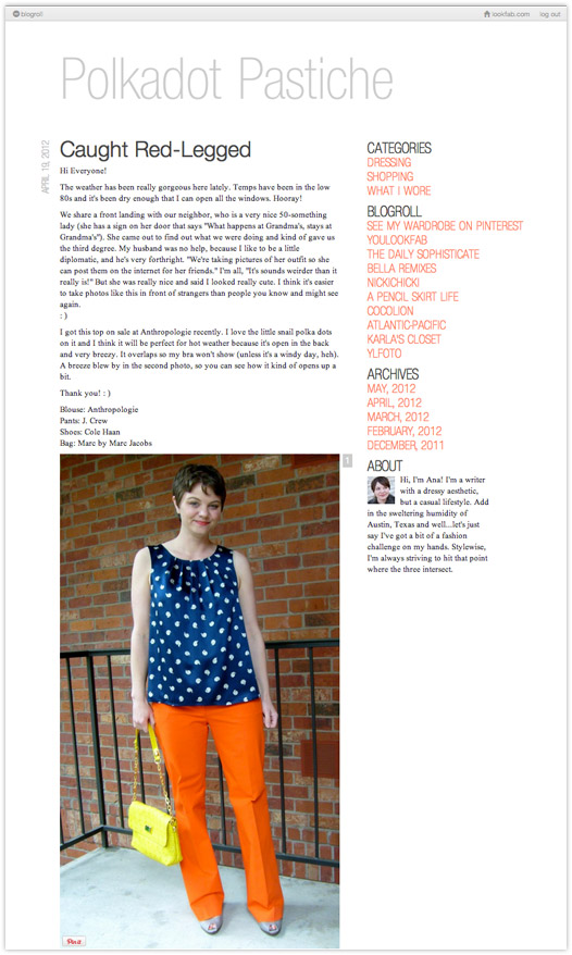
As simple as it is to create and use a lookfab blog, there are also options to customize it and make it your own. As with any other blogging tool, like Blogger or Tumblr, our members can choose the name for their blog on the Internet. For mine, I chose the name “YLFoto”, and my Internet address is ylfoto.lookfab.com.

Here are the lookfab blogs of some other brave early beta testers:

Lookfab bloggers can also customize the appearance of their blog. Right now there are three themes, and each one has some simple things you can change, like fonts and colors. Over time we will expand the themes and the extent to which people can customize them.

Perhaps the most exciting thing about a lookfab blog is the built in audience. Posts to the blog are also posts in the YLF forum, so even a brand new blogger will have immediate engagement from our wonderful forum members. People can respond to posts on the lookfab blog, or in the forum, and all the replies appear in both places.

If you are currently an active member and would like to play with the new feature, just go to lookfab.com and take it from there. You can even make your new blog visible to YLF members only if you’re not quite ready to take on the whole Internet.

If you aren’t already logged in, just use your normal YLF username and password to log in to lookfab.com. If we’ve done our work correctly, the next steps will be self evident. If they aren’t, or if you find anything strange, please let us know using the forum or the contact page, or by sending email to feedback@youlookfab.com. The whole purpose of the beta testing period is to make improvement based on your feedback. We look forward to hearing from you.

New Default Profile Pictures

We recently made some changes to the way profile pictures work on YLF. It was mostly about improving performance, but also gave me the opportunity to do something that has been on my list for ages — default profile pictures. If you don’t upload your own profile picture, the system will select one for you based on information it collects about your flower preferences from the Internet (actually, it is just random).

Here are the twelve options we’re starting with, but we’ll add more over time.

Get Fast Feedback on Your Photos with YLF Realtime

We noticed two interesting things about the forum over the last few months. First, from time to time people need quick feedback. Often, they are about to go out and they want some input on their outfit (the “date night” scenario), but there are other situations too, like being in the middle of a closet cleanup and needing a quick second opinion on one particular item.

The second thing we noticed was that there is almost always someone online in the forum, and during much of the day there are several people online.

So we thought, why not make it easier to get immediate feedback for a quick question. And the YLF Realtime feature was born.

It is very simple to use. When you start a new conversation you will see the new “Realtime” option in the form under the heading “Ask for a Fast Response”.

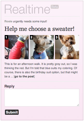
If you enable this option then your post will appear in the sidebar, in a widget like the one on the right. People can view the photos, read your post, and reply to it, right there without changing pages. Only one realtime post can appear in the sidebar at a time, so only the most recent one is displayed. As a reader, if you reply to a realtime post then it will be replaced by the next one in the list.

There are a couple of other differences with a normal post. For one the post appears in the “Realtime” category. Also, the new post indicator will be magenta instead of green in the thread list.

As always, this is easiest to understand if you try it yourself. Open the front page of the forum to see the example post we have created. Type and submit a quick reply and watch the post disappear from the sidebar.

The Realtime Page

You can see all the recent realtime threads in one place by clicking the little clock near the top right of the forum front page (alongside the little heart that takes you to your favorites).

The “Speedy” Role for Realtime Replies

There is a new role associated with realtime replies called “Speedy”. If you reply to a realtime post within ten minutes of it being posted then you will receive a point towards this role. Five points over the last 30 day period and you will be awarded the role itself.

Realtime Limitations

Note that although realtime threads have the advantage of being highlighted in the sidebar, they also have a few limitations.

  1. Realtime posts must have at least one and no more than three photos. The requirement of at least one photo also means that you have to be an “active member” to create a realtime post.
  2. Replies to realtime posts can’t include photos.

Realtime Polls

Finally, you can add a Yay or Nay poll to a realtime post. In fact, polls are particularly useful here because they allow people to give a really quick response.

We’re calling this a “beta” feature because we expect to modify it based on feedback and what we observe. Be sure to let us know what you think using the feedback thread in the forum, or here in the comments.

Create Your Own Yay or Nay Polls in the YLF Forum

Today we are rolling out a new feature that we think will make it easier and more fun to give and get feedback in the forum: the Yay or Nay poll. When you create a new topic you will be given the option “Ask Readers to Vote Yay or Nay”. If you select this option then YLF members will be given “Yay” and “Nay” buttons at the top of your post. As people vote, you and the members that have voted will see a summary of the results alongside the subject title in the thread list and on the topic page.

Some things to note about voting:

  1. Voting is for members. People who are not logged in can’t vote and they can’t see the results.
  2. Votes are separate from replies. You can vote without replying, and you can reply without voting. Or you can do both.
  3. Votes are anonymous. Of course, you can also mention your vote in your reply to let the author know what you think, but by default the vote itself is anonymous.
  4. Results are only visible to voters. Like most polling systems, you can’t see the results until you have voted yourself.
  5. Votes can be changed. You can change your mind and switch from “Yay” to “Nay” and vice versa. You can’t remove your vote entirely though. Once you have voted you are committed to saying either Yay or Nay.

When you create a topic that includes a poll, please think about how your title and post will be interpreted in the context of the Yay or Nay question. For example, a title like “Are these pants unflattering?” with post text of “I need to decide whether or not to buy them” may be a little ambiguous. Does “Yay” mean “yes, they are unflattering” or does it mean “yes, you should buy them”. Ideally, use the “Yay” or “Nay” to refer to the item or the ensemble itself, like Angie does in her Yay or Nay posts on the blog.

To see a Yay or Nay poll in action, take a look at the this topic I posted on the forum: “Will You be Using the New Yay or Nay Polls?“.

This feature is still somewhat experimental, so please feel free to give feedback. We expect to add more poll types over time, so if you have any good ideas we’d love to hear them.

Photog Role and Photos Indicator

While I’m at it I should point out two little features that we have added to photo uploads. First, there is a new role, “Photog“, that you can earn based on the number of photos that you post (20 photos over the last 30 days to earn the temporary role and 200 photos overall to earn the permanent role).

Second, the thread list now contains a little camera icon to make it easy to see those topics that include photos.

As always, if you see anything strange or have any feedback, please let us know using the topics I have created in the forum:

Enjoy!

Tweaks: Front Page Layout and Hiding Photos

I love the iterative nature of developing for the Web. Unlike packaged or downloaded software where there is a lot of overhead in releasing an update, it is very easy to make a small change and take it live. This means that it’s possible to experiment with things and respond quickly to customer feedback or your own new ideas.

An excellent example of this in action was our launch of roles and awards a few months ago. We got some great feedback on the new features and were able to use the input to make huge improvements to the system almost immediately. I LOVE that.

There are also things we need to change about the new look YLF that we launched a few weeks ago. Lots of little things, some of which we’ve dealt with already like text that was a bit light in some places. But also two bigger things: (1) the layout and content of the front page, and (2) allowing members to hide their photos.

Front Page Layout

First of all, why did we change the front page to begin with? A blog is a tried and tested format. Well, the main reason has to do with the frequency of updates. The blog format has the problem that it changes too slowly AND too quickly.

  • Too Slowly: At YLF we publish two posts on Monday to Thursday, one post on Friday and the occasional post over the weekend. Between those times the old site stayed pretty static. That seemed wrong given the hive of activity on YLF.
  • Too Quickly: Sometimes there are things that you want to focus on for longer than half a day. With the old site that was hard to do. You could get a lot of attention on something by posting on the blog, but as soon as the next post went live it dropped below the fold. In this sense the blog changes too quickly.

We saw the front page as an opportunity to address this. The new activity stream surfaces things that you do in the blog, forum and store in realtime as you do them. And the new feature allows us to focus on a topic for longer than half a day, highlighting relevant info in the blog and forum. Fashion week was the first feature, but Angie’s new one on the Autumn Transition will be an even better example. It will point to previous blog entries, new blog entries that Angie publishes over the next week, and related threads in the forum.

What wasn’t working for us in the version we launched on September 6 was the prominence of the blog content in the front page, or rather, the lack thereof. Sometimes we will need the feature to dominate the page, but this won’t always be true. So we now have a design that will allow the feature to be different sizes according to its importance. We have also restored the main blog post of the day to its rightful prominent position at the top of the page.

Finally, we’ve enhanced the activity section with an area for recently started conversations that include pictures. We know that people love photo posts and this is an easy way to discover them.

Photo Upload Management

Before the recent launch of the new site we tested it with a very small group of beta testers. We got some great input that we incorporated before launching, but there was one feature we agreed was important but just weren’t able to do in time: the ability to manage your photo uploads (and specifically, to delete them) outside the post editing form. This is necessary because forum posts can only be edited for 24 hours after posting.

So today we are adding a simple way to hide photos after your ability to edit the post has passed. If you hover over a photo in your post you will see the option “Hide Photo”. Click this and other people won’t be able to see the photo when they read your post. It is easily reversible —  the option will immediately change to “Show Photo”, which you can click to make the photo visible again.

It sounds more complicated than it is. Just load a thread where you have posted a photo and give it a try. Hover over the photo, press “Hide Photo”, then log out and view the page as someone else would see it.

This is certainly not the last word on photo management, but it gives you control over the visibility of the photos you upload. We will add more photo management features over time.

Note that when you hide a photo, a blank placeholder remains in the post where it appeared. This must happen because in the post text you might have referred to the photos by number and we don’t want all of those references to break when you return and hide photos at some point in the future.

It’s About the Little Things

You might also notice other little changes. Most of these are the direct result of your feedback, so thanks very much for caring enough to speak up. And keep it coming! Use the contact form, send me a private message or start a thread in the forum.