Phase 2 of the YLF Redesign: The Phone

In mid March we launched the YLF redesign. One of the features we highlighted then was what we call “Modes”, which lays out the site differently when the browser window is different sizes. The modes are also aware of the iPad, putting the site in narrow mode when the iPad is held in portrait orientation and in wide mode when it’s in landscape orientation.

Angie explained in her launch post that we were also working on a 3rd mode that would make the site easy to use on the smaller screen of a smartphone like the iPhone, Windows Phone or one of the many Android phones. As of a few minutes ago, this 3rd mode is now enabled, and if you browse to YLF on your phone you should see the new layout.

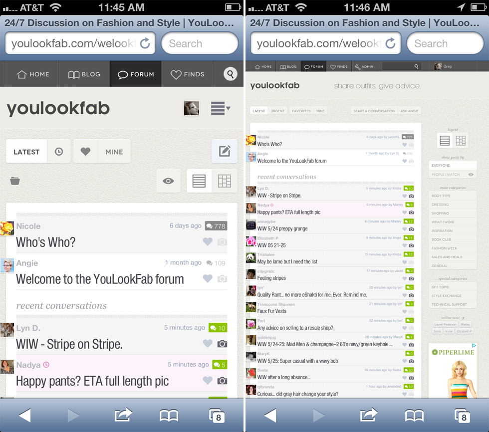
If you don’t have your phone handy, here is the difference you will see on the forum front page. The new phone mode is on the left.

Forum Before & After

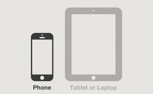
If you would prefer YLF on your phone to look exactly like it would on a computer or the iPad, then scroll to the bottom of any page and click on the tablet icon (that’s the one on the right below). You can also switch back to phone mode by clicking the phone icon on the left. YLF will remember your selection for about one month at a time.

Selector

There are many little differences between the phone mode and the original narrow and wide modes. In some cases things that were in the sidebar on the right are now in the main column. In other cases some non-essential information is left out. It has a different photo viewer that is more suited to a small screen. Phone mode is also a little more like an app in that you can’t zoom in and out.

We have tested the new phone mode quite a lot, but there are many, many phones that we have never even used. So please let us know if you come across any issues. Also, let us know if anything is still hard to use. I’m sure we will need to make refinements.

Enjoy!

Now Open to Active Members: Create Your Own Blog

For the last few months we’ve been beta testing a new YLF feature: An easy-to-use blogging platform for our members to create their own outfit and style blogs. To date we have only had a small group of people testing the feature, but this week we’re opening it up to all YLF members at the “active member” level.

The concept is very simple. As easily as our members can post something to the YLF forum, they can post it to their blog. And getting started with a new blog is a single click affair. One of our goals is to make outfit blogging easier than it has ever been before.

As simple as it is to create and use a lookfab blog, there are also options to customize it and make it your own. As with any other blogging tool, like Blogger or Tumblr, our members can choose the name for their blog on the Internet. For mine, I chose the name “YLFoto”, and my Internet address is ylfoto.lookfab.com.

Here are the lookfab blogs of some other brave early beta testers:

Lookfab bloggers can also customize the appearance of their blog. Right now there are three themes, and each one has some simple things you can change, like fonts and colors. Over time we will expand the themes and the extent to which people can customize them.

Perhaps the most exciting thing about a lookfab blog is the built in audience. Posts to the blog are also posts in the YLF forum, so even a brand new blogger will have immediate engagement from our wonderful forum members. People can respond to posts on the lookfab blog, or in the forum, and all the replies appear in both places.

If you are currently an active member and would like to play with the new feature, just go to lookfab.com and take it from there. You can even make your new blog visible to YLF members only if you’re not quite ready to take on the whole Internet.

If you aren’t already logged in, just use your normal YLF username and password to log in to lookfab.com. If we’ve done our work correctly, the next steps will be self evident. If they aren’t, or if you find anything strange, please let us know using the forum or the contact page, or by sending email to feedback@youlookfab.com. The whole purpose of the beta testing period is to make improvement based on your feedback. We look forward to hearing from you.

New Default Profile Pictures

We recently made some changes to the way profile pictures work on YLF. It was mostly about improving performance, but also gave me the opportunity to do something that has been on my list for ages — default profile pictures. If you don’t upload your own profile picture, the system will select one for you based on information it collects about your flower preferences from the Internet (actually, it is just random).

Here are the twelve options we’re starting with, but we’ll add more over time.

Angie on Bloomberg

This morning Lonnie Kane, CEO of Karen Kane, was interviewed on Bloomberg TV. Michael had previously asked for permission to use our photographs in their promotional materials and contacted us to let us know that they would be used as background shots in this segment. Angie featured in a lot of the shots they used and it was so much fun to see them on TV.

The interview itself is interesting because Lonnie explains why KK has brought most of their production back to the US from China, but if you would like to skip to the Angie bits, they start at 4:24.

Covering the Launch of Karen Kane’s Online Store

Over the next few weeks there will be a lot of Karen Kane coverage here on YLF as we help the company promote the launch of its first online store. I thought the way this came about is an interesting story and perfect material for our backstage blog.

It’s no secret that Angie has been a longtime fan of Karen Kane, both the designer herself and the products that carry her name. But we only started to get to know the company late last year when we were contacted by Karen’s son, Michael. We didn’t know it at the time, but Michael wasn’t yet working fulltime for the family business. Since his communications degree at Northwestern he had been working in entertainment, first at Creative Artists Agency, and then at ID Public Relations as an assistant publicist, but decided that he wanted to get into the apparel industry with his parents. Karen Kane didn’t have a marketing department, but Michael saw the opportunity to reach out to the end customers of their products and wanted to build one from scratch.

From our very first contact with Michael we loved working with him. We get contacted by PR and marketing people all the time, but he seemed to understand where we are coming from, and he clearly had a much deeper understanding of the industry than most. When we found out that he was in his early twenties, it was a great reminder that one should never make judgements about people based on their age or years of experience.

We started to understand the extent to which Karen Kane was a family business when Angie interviewed Karen back in February 2011. Her husband Lonnie is her partner in the business, focusing on the production and financial aspects while she focuses on design. Three out of Michael’s four grandparents have worked at the company. In fact, Lonnie’s mother still runs some aspects of KK administration and comes in 4 times a week. Michael is director of marketing, and his brother Robert is currently working at the company over the summer. As a couple who loves working together — I guess YLF is a family business too — we found this very compelling.

A few months ago we learned that KK would be launching their own online store. Given the great working relationship it was natural for Michael and I to start brainstorming ways that YLF might help KK to promote the new store. For KK, it would help to get the word out to women about their new online presence. For YLF it was an opportunity to try some new promotion ideas and to observe the creation of a new online retail store from up close.

Angie and I love the idea of telling our readers more about the fascinating world of clothing design and production. We had just started to dip our toes into the context of fashion and style with Michelle’s wonderful posts, and this was an opportunity to go deeper and get a true insider perspective on the industry. So tomorrow we start a series of sponsored posts that go behind the scenes at Karen Kane, looking at how different aspects of the business work. We hope we can convey the excitement of seeing an insider’s perspective of the KK operation.

We plan to continue bringing you the behind the scenes perspective beyond KK’s July launch. And after all the fascinating rag trade stories we heard during our time with the Kane family last week I am trying to convince Michael to write an insider’s column on YLF (so if you like that idea then be sure to say so in the comments to this post!). We’re also hoping that this can be a model for the way we work with other businesses who would like to open up their process to YLF scrutiny.

Putting Fashion and Style in Context

Angie and I often talk about how lucky we are that the YouLookFab community developed the way it did. So many smart, fun, compassionate people in one place all talking about something that we are passionate about too: fashion and style. There is seemingly no end to the interesting questions, great new outfit ideas and fun topics.

We’ve also noticed that the interest doesn’t end with the outfits. Angie’s occasional posts that dig into the mechanics of the fashion industry, its role in society and its impact on the environment always generate a lot of enthusiastic and thoughtful discussion. This totally makes sense: if you’re interested in fashion and style, then you’re probably also interested in the context of fashion and style. You aren’t satisfied just accepting the lack of small sizes, or the abundance of summer dresses in mid-Winter, or the sudden hike in prices. You want to know why things are the way they are, and discuss this with other people who, like you, see fashion as more than just a pretty ensemble.

So we’re going to experiment with the idea of writing more about the context of fashion on YLF. We don’t plan to post less of Angie’s advice and analysis, but we would like to post more about the broader context of Angie’s articles.

Since this is a little more like journalism than Angie’s current writing, we reached out to a journalist to help us get it off the ground — our very own Michelle McQuigge, a long time YLF forum member. While Angie continues to post as before, Michelle and I will be looking for opportunities to start conversations around the business, culture, technology and environmental impact of fashion. Obviously, as an 18 year veteran of the fashion industry, Angie is sure to be our most important “source”.

We’re not quite sure where this will end up, but we’re starting things off with today’s article by Michelle — some fascinating background on imminent apparel price hikes and their likely consequences for consumers. We hope you enjoy it!

Get Fast Feedback on Your Photos with YLF Realtime

We noticed two interesting things about the forum over the last few months. First, from time to time people need quick feedback. Often, they are about to go out and they want some input on their outfit (the “date night” scenario), but there are other situations too, like being in the middle of a closet cleanup and needing a quick second opinion on one particular item.

The second thing we noticed was that there is almost always someone online in the forum, and during much of the day there are several people online.

So we thought, why not make it easier to get immediate feedback for a quick question. And the YLF Realtime feature was born.

It is very simple to use. When you start a new conversation you will see the new “Realtime” option in the form under the heading “Ask for a Fast Response”.

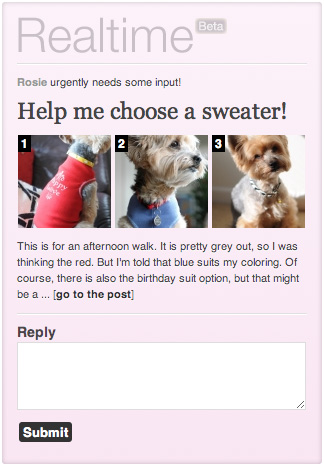
If you enable this option then your post will appear in the sidebar, in a widget like the one on the right. People can view the photos, read your post, and reply to it, right there without changing pages. Only one realtime post can appear in the sidebar at a time, so only the most recent one is displayed. As a reader, if you reply to a realtime post then it will be replaced by the next one in the list.

There are a couple of other differences with a normal post. For one the post appears in the “Realtime” category. Also, the new post indicator will be magenta instead of green in the thread list.

As always, this is easiest to understand if you try it yourself. Open the front page of the forum to see the example post we have created. Type and submit a quick reply and watch the post disappear from the sidebar.

The Realtime Page

You can see all the recent realtime threads in one place by clicking the little clock near the top right of the forum front page (alongside the little heart that takes you to your favorites).

The “Speedy” Role for Realtime Replies

There is a new role associated with realtime replies called “Speedy”. If you reply to a realtime post within ten minutes of it being posted then you will receive a point towards this role. Five points over the last 30 day period and you will be awarded the role itself.

Realtime Limitations

Note that although realtime threads have the advantage of being highlighted in the sidebar, they also have a few limitations.

  1. Realtime posts must have at least one and no more than three photos. The requirement of at least one photo also means that you have to be an “active member” to create a realtime post.
  2. Replies to realtime posts can’t include photos.

Realtime Polls

Finally, you can add a Yay or Nay poll to a realtime post. In fact, polls are particularly useful here because they allow people to give a really quick response.

We’re calling this a “beta” feature because we expect to modify it based on feedback and what we observe. Be sure to let us know what you think using the feedback thread in the forum, or here in the comments.

Create Your Own Yay or Nay Polls in the YLF Forum

Today we are rolling out a new feature that we think will make it easier and more fun to give and get feedback in the forum: the Yay or Nay poll. When you create a new topic you will be given the option “Ask Readers to Vote Yay or Nay”. If you select this option then YLF members will be given “Yay” and “Nay” buttons at the top of your post. As people vote, you and the members that have voted will see a summary of the results alongside the subject title in the thread list and on the topic page.

Some things to note about voting:

  1. Voting is for members. People who are not logged in can’t vote and they can’t see the results.
  2. Votes are separate from replies. You can vote without replying, and you can reply without voting. Or you can do both.
  3. Votes are anonymous. Of course, you can also mention your vote in your reply to let the author know what you think, but by default the vote itself is anonymous.
  4. Results are only visible to voters. Like most polling systems, you can’t see the results until you have voted yourself.
  5. Votes can be changed. You can change your mind and switch from “Yay” to “Nay” and vice versa. You can’t remove your vote entirely though. Once you have voted you are committed to saying either Yay or Nay.

When you create a topic that includes a poll, please think about how your title and post will be interpreted in the context of the Yay or Nay question. For example, a title like “Are these pants unflattering?” with post text of “I need to decide whether or not to buy them” may be a little ambiguous. Does “Yay” mean “yes, they are unflattering” or does it mean “yes, you should buy them”. Ideally, use the “Yay” or “Nay” to refer to the item or the ensemble itself, like Angie does in her Yay or Nay posts on the blog.

To see a Yay or Nay poll in action, take a look at the this topic I posted on the forum: “Will You be Using the New Yay or Nay Polls?“.

This feature is still somewhat experimental, so please feel free to give feedback. We expect to add more poll types over time, so if you have any good ideas we’d love to hear them.

Photog Role and Photos Indicator

While I’m at it I should point out two little features that we have added to photo uploads. First, there is a new role, “Photog“, that you can earn based on the number of photos that you post (20 photos over the last 30 days to earn the temporary role and 200 photos overall to earn the permanent role).

Second, the thread list now contains a little camera icon to make it easy to see those topics that include photos.

As always, if you see anything strange or have any feedback, please let us know using the topics I have created in the forum:

Enjoy!

About Time: Angie on Video

For years Angie and I have been talking about doing short video segments for certain topics. Before Angie’s appearance on NBC we did a few experiments that just confirmed for me how much the camera loves Angie and her personality. But since then we just haven’t got around to it. So we set ourselves the goal to get a video published by the end of this week.

On Tuesday morning I had an hour or so before a lunch meeting so I set up the camera. Within half an hour we were done. The result isn’t perfect – I have a lot to learn about capturing decent quality video – but it’s a start. I’m going to outline my primitive approach in this post and I’d love to to hear your advice and suggestions in the comments.

Equipment

My Nikon D90 captures reasonable video. It has some serious limitations (for example, no way to connect an external mic — more on that below), but it is certainly good enough for now. The only other thing we needed was a tripod.

Exposure and Focus

This isn’t a big problem. The exposure in our first video isn’t perfect, but it is consistent over time. And the fact that Angie stays in one position throughout the video means that a single focus point is fine.

One crucial thing was setting exposure lock so that the exposure didn’t change during the video as Angie moved around. The trick was to go in the menu to “Controls/Assign AE-L/AF-L button” and set that to “AE Lock (hold)”. Then after starting to record I could press the “AE-L” button on the back of the body to lock the exposure for the rest of the recording.

Lighting

We found a spot where there was a good deal of natural light from a window. It wasn’t ideal and you’ll see Angie’s arms get over exposed when she moves them closer to the window. I think we need some sort of simple lighting setup that makes us less dependent on natural light. One more thing I need to investigate.

Audio

This is probably the thing I’m least happy with in the video. One issue is the sound of our old fashioned clock ticking away in the background, but that’s easily solved. The real problem is the fidelity: the audio quality is low in general and there is distortion when Angie raises her voice a little. The microphone in the D90 is not great and it is too far away from Angie.

Unfortunately the camera has no way to connect an external mic, so the options are to record sound separately and mix it with the video later, or use a different camera. The gear-head devil on my left shoulder is salivating at the idea of a nice new digital video camera, but the angel on my right shoulder has vetoed that option until we’re publishing video on a regular basis.

Post-Production

I spend a lot of time in Adobe tools like Photoshop and Illustrator, so I experimented briefly with their consumer video tool called Premiere Elements. But iMovie that shipped with my Mac was easier to use. If we start doing a lot of video I will consider investing in the full version of Adobe Premiere. I do need to figure out what real benefits this will offer because like the other Adobe tools, it ain’t cheap.

Hosting

YouTube is the obvious place to put video. It has the most users and definitely offers the best chance of your video going viral. Unfortunately it is also ugly, with all kinds of nonsense popping up when you hover over the frame and after the video runs to completion.

Vimeo is a great alternative from a user experience point of view, but they are a community for strictly non-commercial video. Another option is to host the video on our own server, but then we lose the viral benefits of YouTube and put additional load on our (already groaning) server.

Lots of new things to think about, but we’ll have some fun figuring it all out. All you videographers out there please weigh in with any advice you have on lighting, audio, hosting or any other aspect of video capture and production.

PS: For fun, here is a (12 second!) video I uploaded to Vimeo as an experiment a couple of years back when we were getting ready for the NBC appearance. Looking back at this two things jump out at me: (1) I have a voice that is best suited to silent movies and (2) this setting is much nicer than the one we used for this week’s video. The background has nice depth of field and the lighting is much more natural.
The YLF Cover for October

Forum member RoseandJoan suggested a backstage post on how we selected the October cover (or background image). That sounded like a fun idea, so here it is.

Before we made the final decision to implement the chameleon feature we brainstormed a list of potential covers for every month of the year. We wanted to make sure that the ideas wouldn’t dry up after the first month or two. In a few minutes we had a long list of possibilities and the confidence that we could easily find something interesting for each monthly cover. Fashion is so visual, and you can also throw in things like the seasons that are so relevant to what you wear.

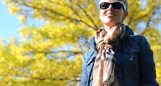
For October I really wanted to feature the changing leaves because Autumn colors are one of the things that makes the season Angie’s favorite. A few days ago the weather was nice, so with camera in hand and two Autumn-y scarves we set out to find a nice backdrop. We found the first possibility in Powell Barnett Park near where we live and got some nice shots. The light was catching the tree in a great way, and the blue sky was great with Angie’s denim jacket.

Angie then had the idea that we could use a photo of her Frye boots in amongst the Autumn leaves. She helped nature a bit by collecting some of the red leaves and scattering them on the ground where she stood. It was a great idea, but the photos I took let it down. Although the picture below looks quite nice, none of the photos were good enough when enlarged to the size we need for a background. Still, we used one of them in the September newsletter.

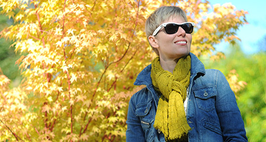
For a third option we went to the nearby house of our friends Phoebe and Marcus. A week before I had noticed that the Japanese Maple in their garden was looking like the perfect backdrop for the October cover. This third set of pictures was probably the best in terms of lighting and the richness of the colors, but we just couldn’t get it to work as a background. The deep Autumn hues made the background too overpowering.

Getting the photos is actually one of the easier steps in the process of creating the background. Although there are a few hundred photos to sift through, it doesn’t take long to get down to about 10 candidates. Then it’s a matter of experimentation. I put together a template to make things efficient in Photoshop, but it is still tricky to find the right part of the right picture. A background that will enhance the experience, but won’t draw too much attention to itself. In this respect the October cover is an improvement over the one we launched with in early September.

There are many other details to think about. For example there must be a fairly natural way to ease from the picture into a block of color further down the page, and the text in the header must be readable when it is superimposed on the background. Finally, I have to cram this large image into a small file that doesn’t take too long to load. Many years ago I wrote software that compressed images so I know a few simple tricks that make this possible.

All this takes time. I have done about 20 backgrounds so far and many of the opportunistic ones were very quick. I saw a picture and thought, wow, that will make a great background. And often it did. But the ones like the October cover where we started with an idea take much longer. We think its worth it because it has quite a big effect on the feel of the site. If we do it well, the site feels familiar, but fresh.