Forum member RoseandJoan suggested a backstage post on how we selected the October cover (or background image). That sounded like a fun idea, so here it is.
Before we made the final decision to implement the chameleon feature we brainstormed a list of potential covers for every month of the year. We wanted to make sure that the ideas wouldn’t dry up after the first month or two. In a few minutes we had a long list of possibilities and the confidence that we could easily find something interesting for each monthly cover. Fashion is so visual, and you can also throw in things like the seasons that are so relevant to what you wear.
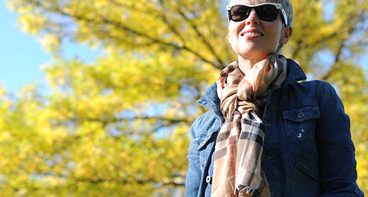
For October I really wanted to feature the changing leaves because Autumn colors are one of the things that makes the season Angie’s favorite. A few days ago the weather was nice, so with camera in hand and two Autumn-y scarves we set out to find a nice backdrop. We found the first possibility in Powell Barnett Park near where we live and got some nice shots. The light was catching the tree in a great way, and the blue sky was great with Angie’s denim jacket.
Angie then had the idea that we could use a photo of her Frye boots in amongst the Autumn leaves. She helped nature a bit by collecting some of the red leaves and scattering them on the ground where she stood. It was a great idea, but the photos I took let it down. Although the picture below looks quite nice, none of the photos were good enough when enlarged to the size we need for a background. Still, we used one of them in the September newsletter.
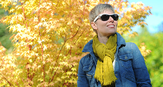
For a third option we went to the nearby house of our friends Phoebe and Marcus. A week before I had noticed that the Japanese Maple in their garden was looking like the perfect backdrop for the October cover. This third set of pictures was probably the best in terms of lighting and the richness of the colors, but we just couldn’t get it to work as a background. The deep Autumn hues made the background too overpowering.
Getting the photos is actually one of the easier steps in the process of creating the background. Although there are a few hundred photos to sift through, it doesn’t take long to get down to about 10 candidates. Then it’s a matter of experimentation. I put together a template to make things efficient in Photoshop, but it is still tricky to find the right part of the right picture. A background that will enhance the experience, but won’t draw too much attention to itself. In this respect the October cover is an improvement over the one we launched with in early September.
There are many other details to think about. For example there must be a fairly natural way to ease from the picture into a block of color further down the page, and the text in the header must be readable when it is superimposed on the background. Finally, I have to cram this large image into a small file that doesn’t take too long to load. Many years ago I wrote software that compressed images so I know a few simple tricks that make this possible.
All this takes time. I have done about 20 backgrounds so far and many of the opportunistic ones were very quick. I saw a picture and thought, wow, that will make a great background. And often it did. But the ones like the October cover where we started with an idea take much longer. We think its worth it because it has quite a big effect on the feel of the site. If we do it well, the site feels familiar, but fresh.


