OR

Team High or Team Low Colour Contrast

Do you prefer to create a high or a low contrast between the colours in your outfit?

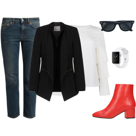
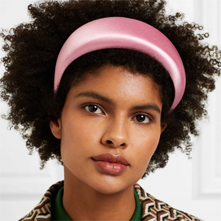
I am 100% Team High Colour Contrast. There has to be a high colour contrast in my outfit in order for it to feel like me. I can achieve the contrast with accessories, clothing and footwear. When I wear black from head to toe, I’ll wear white pearls or a bright scarf to soften the harshness of the black against my face, and to create a strong contrast against it. When I create low contrast on top, like a red top with a red jacket, I’ll pair high contrast shoes, specs, belt or handbag with the outfit. My cream coats and jackets are low contrast against my blonde hair and pale skin, but wearing a black top underneath these items instantly creates the contrast. The black buttons on my cream jackets and coats also create strong visual contrast.

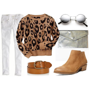
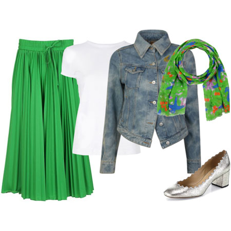
Another way I introduce contrast is with bright clashing colour combinations, like red with yellow, turquoise with red, fuschia with white, and purple with green.

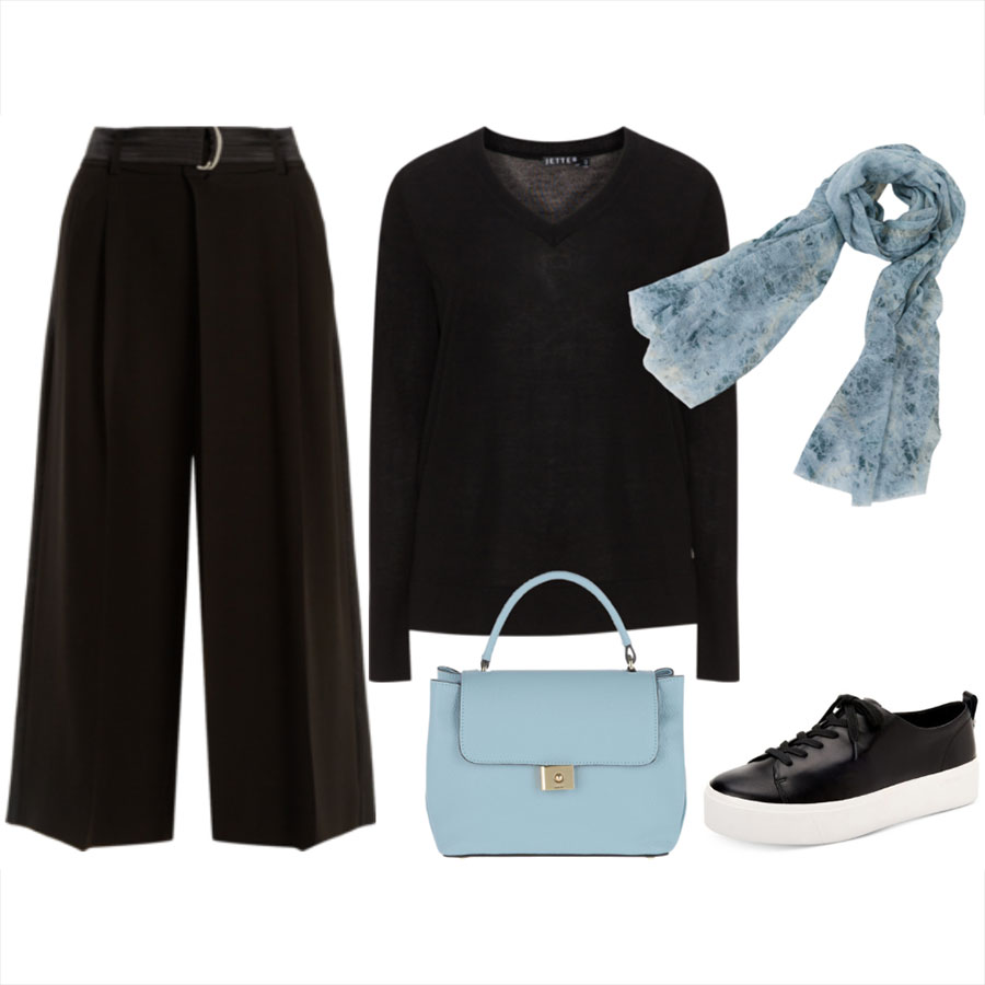
When I do wear a low contrast outfit like ink blue with black, it’s always with white or cream in order to add back in the element of high colour contrast.

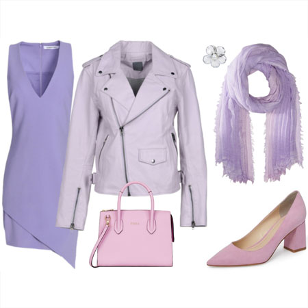
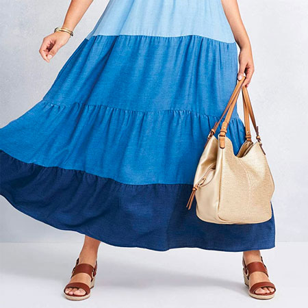
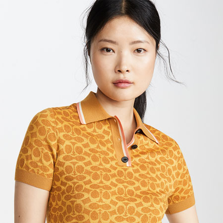
Team Low Colour Contrast prefers to wear a monochromatic ensemble and colours in the same colour family. For example, a black dress worn with a gunmetal grey necklace, pewter shoes and eggplant handbag is a low colour contrasting outfit. Wearing a white dress with pastel pink cardigan, silver sandals and white handbag is another example.

Swap out the pastel pink for fushia and throw in black shoes and belt, and you’re back on Team High Colour Contrast.

Note that contrasts can be created with both neutral and non-neutral colours. This is not a brights versus neutrals distinction at all.

It’s interesting to observe this style distinction between my clientele because there are clearly two camps. Importantly, there is absolutely no right and wrong here. The one you prefer depends entirely on your aesthetic preferences. And perhaps you like to switch between high and low contrast depending on your mood.

Over to you. Are you Team High or Team Low Colour Contrast? Although I’d prefer you to pick a side, I’ll allow batting for both Teams because it’s the last week of the year. But if you do pick both, then let us know what makes you decide between high and low contrast for any particular outfit.

Comment RSS

80 Comments on...
Team High or Team Low Colour Contrast

I’m 100% low contrast.. don’t know why.. it’s a personal taste!

I think I’m basically high contrast, because I have high square shoulders and if I’m not to look like a brick with legs, I have to create obvious lines to break up my upper body. My mad contrast skillz rely heavily on cardigans. I also think it’s important for me to have contrast between my pale skin and whatever I’m wearing on top. I end up gravitating to dark bright colors even in summer.

My first instinct was to say low contrast, but now I come to think about it I think I’m much more on Team High Contrast. I’ve been noticing recently even though it’s winter and I’m wearing a lot of dark neutrals, I’m reaching for things like a bright scarf or my white watch to add some interest and, yes, contrast!

Low contrast feels kind of sophisticated and elegant to me, but with my dark colouring I feel I’m liable to be swallowed up into a homogenous mass if I don’t create a bit of contrast in most of my outfits.

On the whole I prefer high contrast x

I’m pretty much low contrast. It’s pretty rare I wear a high contrast outfit – with the exception of scarves! I OFTEN wear a bright scarf with an otherwise low contrast outfit. Not sure where that puts me.

But I LOVE seeing high-contrast outfits on others… so stylish!

I used to be low contrast but as I get older I tend toward high contrast. I am a liberated quiltmaker and my work with fabric and color has made me more adventurous with my clothing choices. I have a bright orange t-neck that I love to pair with my purple cardigan. Green is also a good combination with purple. Like Firefly when I dress in dark neutrals I reach for my favorite teal scarf. I also have a wonderful sort of striped scarf with lots of colors that can be used to brighten any outfit up.

I have very pale skin and dark hair so I am already high contrast before dressing! I like bold colors to brighten my face and usually wear dark bottoms so I am high contrast. One contrast that bothers me, though I notice it doesn’t bother a lot of you, is dark hose/tights with a cream or white skirt. Just a personal preference I guess.

I like high contrast, and like Lynn, I have dark hair and very pale skin. I sometimes find it difficult to achieve, though, because it seems hard to find brightly colored tops, and I almost always wear dark bottoms. I hadn’t thought of trying to use accessories to add contrast, and that’s something I’d like to try more.

Team low contrast. It’s more in line with my coloring: greenish hazel eyes, light reddish brown hair.

I am usually high contrast BUT I do love to work a mono-chromatic look. Making sure the change up the texture and fabric so that it is not too one note. Also on the other han even with the monochromatic looks I do always put in a pop of color like a great scarft ot handbag so I guess that means I am 100 percent high contrast :)

Sophie,

http://www.cluelessbaroness.com

I’m low contrast all the way. I wear light and medium colors together, or medium and dark colors together. Rarely light and dark. I do like lots of color, just not too contrast-y. I recently paired a black party skirt with an ivory tank top for a wine tasting. If it weren’t for the gold beads and sequins on the top, I wouldn’t have left the house!

Definitely high contrast though I always look to add my high contrast in ways that create a slimming column of color (thanks Imogene!) so that the contrast helps create illusion of curves and/or height. For instance, cream top & bottom topped w/bright long cardi. Or monochromatic outfit accented by bright long scarf and bright handbag.

The pop of color helps perk up my mood; the only time I go low contrast is if I’m using bright colors to begin with; such as coral skirt, apricot tank top & peachy/guava colored cardi and coral statement necklace.

I much prefer high contrast to my outfits. :)

I lean towards high contrast and usually that’s what I do, but sometimes I do low contrast. Today I’m wearing black and charcoal and ink blue and I’ll probably pair it with a gunmetal necklace. Honestly, it mostly depends on what’s clean!

I’ve been waiting for this Team X team Y. ;) Definitely, high contrast for me. It’s why white is my signature color with my dark skin.

I am most definitely low contrast. I love the look of tone on tone. It works much better on me. I will create medium contrast such as cognac and black but hardly ever black and cream. High contrast does not work with my skin-tone and hair.

I also use color contrasts but the colors are nearly always mid value- (meaning if you put the color of the bag or dress on a swatch and ran it through the copy machine it would be a medium grey.

I love high contrast on those with very dark or very light hair and sculpted features- (like Angie, Taylor and Maya) Also Audrey Hepburn and Blondie. I think they always wore high contrast. Nicole Kidman comes to mind as low contrast. Vanessa Redgrave in Camelot.
Almost all of her costumes were low contrast and the color was very neutral but rich.
Color can seem very rich when there is low contrast even if the color by itself is not that bright.

(I am being an art teacher).
As Angie states both are beautiful on the right person. Knowing what works best is a great way to enhance personal style!!

Another art comment.
Bright does not mean light. Low contrast can have very intense color . Turquoise and red are still low contrast but can be almost the same value – mid grey if copied.
Bright purple is low contrast with black. Bright yellow is low contrast with white.

Greenglove has spoken and I can’t add much. While I admire high contrast, I generally feel uncomfortable with it. Low to medium works much better with my coloring. One exception is black with cream plus a dash of color–it works better in summer.

I never really thought about it before, but I am Team Low Contrast. I really feel more comfortable with low contrast outfits, and that is something that I have been discovering over the last year. Hearing it put so succinctly makes the penny drop.

Team low contrast ALTHOUGH I do love to wear black and white.

Team Low Contrast here! Matching similar color outfits appeals to me more (even though I love the high contrast ensembles presented by Angie and others), I don’t trust my instincts enough I think.. I love to break the low contrast by a bright scarf or a bag (for example, olive green/gray/black with a bright orange or turquoise scarf).

I think I’m Team High Contrast, although I probably wear a lot of both.

I was wondering when Team Low Colour Contrast was going to chime in! For a moment, this poll was heading in an unexpected direction. Since the Teams are evening out, I feel less surprised with the results.

Thanks for chiming in with your professional opinion on colour, Greenglove. I love hearing your perspective and value the wisdom – plus your celebrity examples are spot on. I adore your low colour contrasting outfits since they suit you to a tee. I’ll wear high colour contrasts on your behalf :-)

Team neither. I don’t think I have strong feelings about this. I make my outfit decisions based on other factors long before I consider the contrast.

I was a low contrast girl, very matchy-matchy, simply because I thought that’s the way one should dress. You’ve taught me how to dress in a “contrast” way, and I love it! I rarely dress in a high contrast way, but as Greenglove states, there are color contrasts other than simply high, along with textural contrasts, too. I have enjoyed experimenting with my wardrobe and coming up with creative combinations that I would never have done before Angie! Thanks for your teaching!

High contrast at work, low contrast on the weekends. This does change according to mood, but I generally don’t want to stand out on the weekends.

I would say Team High Contrast, though my own coloring is more low contrast.

Low contrast is so totally chic!

I’m definitely high contrast. It’s such a great way to highlight one aspect of your outfit. If I were a painter and had a blank canvas, I’d splash on the color and outline it in black, like Matisse, or pop contrasting colors together like Derain, of the Fauvists! So, if I’m all in black, I look for a bright red or pink scarf or piece of jewelry. If I’m wearing a one color dress I’m always looking for the opportunity to create some contrast to add visual interest or surprise, like with a contrasting color cardigan or shoes. Fun question Angie.

Definitely team high contrast! I’ve had more fun experimenting with monochromatic looks since reading Angie’s tips on texture (they’re particularly easy for me to implement, afterall), but I was raised to strie for pops of colour and now feel more comfortable when doing this. I generaly sport dark bottoms and always feel best when colourful tops, scarves or necklaces make an appearance.

My pleasure, Rhonda.

Maya, Team Neither does not exist since every outfit has a low-ish or high-ish colour contrast to it – that’s why no one is on the bench for this game :-) . I would hazard a guess that you bat for both Teams here.

I am team high contrast but not by conscious thought – it just seems that’s how I’m more comfortable dressing. In fact, this may be why a recent WIW didn’t appeal to me but many others gave it a thumbs up – it just felt blah to me. Hmmm, you again have me thinking about dressing in ways that never occured to me before. :)

I love high contrast looks but usually always default to low contrast when it comes to how I dress. I don’t like to stand out–I prefer to blend in.

Team high contrast for me. I always feel weird when I wear fully monochrome outfits and need to go put on a contrasting color belt or scarf or something.

Prior to YLF, I was batting for Team Low Contrast. As Rhonda stated, I was very matchy-matchy. Now I am learning to branch out, use more color, and create high contrast in my outfits. I think this is best showcased in my outift from yesterday, a grey/black striped cardi, with a black skirt, contrasted with a bright berry colored knit top.

I’m team high contrast, I think. I like strong colors such as red with turquoise, red with purple, lime with navy etc. But I do wear a lot of blue and purple which are probably low contrast colors? I suppose I am team low contrast for the moment with what I wear and moving into team high contrast as I branch outside of my comfort zone into more “look at me” outfits.

If I had to pick a side, I would say team High Contrast, but in reality I think I’m more team Medium Contrast, or bat for both teams. I don’t usually go for complete opposites such as black and white, but I’m very apt to pair multiple bright colors with varying degrees of saturation together in the same outfit. I love my bright and jewel-toned colors.
Looking through my WIW photos, I really can’t tell whether I wear high contrast or low contrast outfits more often because most of my outfits are somewhere in between, but most of my favorite outfits are leaning towards the high contrast end.

Definitely Team High Contrast for me. Even it if it’s just my scarf, I usually have at least one high contrast piece on. I like something that “pops.” I will say though, that even though I am definitely high contrast, I really like the low contrast look. I think it looks very classy and very classic, I just prefer high contrast given my darker skin and black hair.

Always Team High Contrast although I love Team Low Contrast’s ability to look chic and elegant. Even my house is high contrast!

I’m definitely a Team High Contrast all the way! Always have, always will:-) That’s 1 of the many reasons I love, love, love viewing photos of Angie’s outfits. Her use of color contrast is outstanding!! In fact, I would really enjoy viewing more Angie outfits. It would be cool to see how she incorporate her tips/suggestions into her outfits. That gives us all something to ‘copy.’

Great job this year, Angie!

High contrast all the way! I use white or cream very often with reds and blacks and bright yellows.

Batting for both teams! I really like the visual impact of high contrast, but with my coloring, I wear a lot of mid-contrast … mid blues with grey, for example.

I definitely dress low contrast, but I find high contrast more visually appealing. So, one of my new year resolutions is to try more high contrast looks!

This one is easy. High contrast for sure! I feel very drab if I don’t have lots of contrasting (and sometimes clashing) colours :)

I’m mostly Team High Color Contrast! I can’t resist a great pop of color (especially in my shoes).

However, there’s about 20% of the time where I’m team low color contrast.

So interesting, Angie and Greenglove!

I think I prefer high contrast probably because of my dark hair and fair skin, though GG’s points about rich colors in a low contrast intrigue me. For example, today I am wearing a very boring outfit in terms of the actual pieces (chocolate brown chinos and a brick-red laying tee), so don’t feel that fab but I do like the colors together … and its a low contrast with deep colors.

I sure did not think about such a concept as high or low contrasting style before YLF. I have in my life batted for both teams. As I get older I am a low contrast person. I do like a pretty white or preferrably an eggshell color blouse and dark pants, but I would have to put something over the blouse to tone down the contrast. In the past the high contrast would have worked for me.
By the way Angie and Tereasa, since I have ventured into having darker hair color I am having so much more fun wearing colors I didn’t feel good in before, so thank you both for the encouragment.

High Contrast!

Put me on team high contrast. My big exception is on really cold days when I need a ‘coziness’ boost. Dark, rich low contrast colors make make me feel cozier

Because I have fair skin and dark hair, everything I wear is in some way or the other creates a high contrast, so I just go with it :)

It depends entirely on my mood. I seem to choose high contrast outfits when I am feeling more loud and boisterous, and low contrast outfits when I want to blend in more.

I think I’m mostly low contrast because I find it slimming to be one column of color but I am a little confused because I love to wear white pearls with my ubiquitous blacks and charcoals. Hmmm.

I think it changes for me with the seasons.

In the winter I am definitely low contrast. I tend to wear lots of monochromatic and analogous ensembles. In the summer I tend to bring out bright colors that I mix with high contrast scarves, shoes, and jewelry.

I live in Arizona, so the weather doesn’t change dramatically in the winter. I think the wardrobe change is my desire to create a seasonal change when mother nature doesn’t do it for me.

I think low contrast is so uber chic, but I dress myself in high contrast. I prefer the contrast to be between my clothing and accessories – almost always low contrast clothing choices with pops in my accessories.

Don’t know why low contrast seems so chic to me and yet I do the opposite??

I tend to be team low contrast, although today’s outfit, black with pale green and white would land in high contrast I suppose.

But all in all, I lean towards low contrast.

Like others who have commented, I have a appreciation for the opposite, in this case, high contrast… but find myself wearing low contrast most of the time.

High-contrast combinations look better on me because I have dark hair and very fair skin. However, if I don’t want to look overly dramatic, I will go for a lower-contrast look sometimes. I vote high-contrast though.

Most of the time I am team low contrast. I seem to be attracted mostly to monochromatic schemes.

Definitely team low contrast.

I think I’m Low Contrast, but really, I’m not at all sure. I’ll have to pay more attention over the next couple of weeks.

low contrast all the way

High contrast for sure! I only like to wear things that create contrast with my skin (fairly light), and I feel like i look horrible in middle colors. I mostly wear darks, but occasionally white or another extreme light color.

I think I am team low to medium color contrast. I’m not comfortable with full on white and black.

I was low contrast today, but I looked back through my WIW photos and it turns out that was an anomaly — I am almost always VERY high contrast! LOL

I used to be team Low Contrast, and now I’m team High Contrast (at least I think so). I could see my future style self going back to low contrast.

Although recently I wore a black and blue outfit with black accessories, and was happy as a clam. So I can be moody about this, too.

I may have to bat for both teams, since you are allowing it. I feel that I should probably be low contrast, at least in tops with bottoms, in order to look taller. Today I’m dressed that way in head to toe taupey brown (but a red bag and when going out adding a red and orange print scarf). Some days it feels good. Other days it feels boring. Since finding YLF, I’ve been seeing how much better some ivory pearls look with an otherwise black outfit or how a bit of color in a cami or other accessories can make an outfit more interesting. Prints that are low contrast are appealing sometimes but most in my closet are more high contrast.

Greegloves, I love the analagy of a black and white copy to see colour value! And Kari, I suspect you may be team lowcontrast, as your outfits are colourful, but with similar value. If you pop yourself on Greengloves copier we’ll be able to see it :) .

A lot of people have referenced their own colouring as deciding their team, and I am the same: my colouring is fair everything, and I definately look better in low contrast, and tone-on-tone colours.

Have to add that high contrast is a look I LOVE on others…

Team high contrast for me. I have dark hair so maybe match what Greengloves color wisdom. However, I would not have thought turquoise and red to be low contrast since the colors are so different, even if they photocopy in mid grey.

Team low contrast – good thing I am now aware of this. Instinctively I have always felt that low contrast clothing puts a nice emphasis on the face.

I was definitely a low contrast kind of girl in the past, but I think I’m leaning towards Team High Contrast now. Since joining YLF I’ve started to experiment with brighter colours and brighter contrast and I love what I’m seeing. (purple coat with bright green scarf, cobalt blue turtleneck sweater with black jeggings, bright blue button-down shirt with a lime green scarf…).

Definitely team high contrast, although every now and again I wear a very dark, no contrast outfit. High contrast has my heart though!

High contrast all the way!

To me, low contrast when done right looks classy. No matter how well you do high contrast, it always is just a touch too showy for me. My senses are usually too overwhelmed by the bright colors to notice the rest of the outfit…or the person wearing it.

This is a no brainer for me. High Contrast all the way! I feel like putting contrasting colors in an outfit really makes people sit up and take notice and that’s what I love. :)

I am going to use this opportunity to bat for both teams! I personally prefer high contrast, but as a Summer look better in low contrast outfits do I tend to wear both fairly equally.

Clearly High Contrast! For me, its part of being on Team Brights, since those fun colors look great when they stand out against each other or in contrast with more muted shades.

Definitely high contrast! My fall-back colour palate is purple, orange and lime green all together. :) I’ve tried to wear low contrast outfits, but I usually end up throwing on a pair of bright tights to break it up.

I have low contrast colouring and small features and can fell easily overwhelmed by high contrast clothing and accessories, for the most part I’m team low contrast but I don’t think I could function without black and cream in my wardrobe.

I’m going to bat for both teams, with preference changing depending on season. I think I favor lower contrast outfits overall, but with my very light skin and very dark hair I’ve always got some built in contrast regardless of the clothing I have on.

I’m batting for both teams but more often than not i do the high contrast thing!

On me, low contrast looks best. It all depends on your personal coloring and personal preference. I don’t dislike high contrast on those who can wear it. It just doesn’t work well for me.

Leave a Comment


OR